Accessible Design of Consumer Products
SECTION 2: INPUT / CONTROLS. Includes keyboards and all other
means of communicating to the device
Maximize the number of people who can ...
I-1. Maximize the number of people who can ... reach the controls.
Problem:
Controls, keyboards, etc. may be unreachable or unusable.
Examples:
- Individuals who use a wheelchair, who are very weak or who
are extremely short may be unable to reach some controls, keypads,
etc., well enough to use them.
- Individuals with poor motor control may be able to reach the
controls, but may find them too small or close together to accurately
operate the proper knobs, buttons, etc.
- Individuals with severe weakness may be able to reach the
controls, but may find the act of reaching or holding position
in order to manipulate the controls too tiring.
Design Options and Ideas to Consider:
- Locating controls, keyboards, etc. so they are within easy
reach of those who are in wheelchairs or have limited reach.
- Locating controls so that the user can reach and use them
with the least change in body position.
- Locating controls which must be constantly used in the closest
positions possible and where there is wrist or arm support.
- Providing a (redundant) speech recognition input option.
- Offering remote controls (wired, wireless or bus operated).
Additional Information:
- Accessibility to a control becomes less critical if the control
is for an adjustment that is only occasionally used or used only
at setup time.
- Avoid placement that requires the user to lean around the
side or back of the device to see or operate the controls.
- Voice controls (i.e., controls employing speech recognition)
may be inaccessible for those with speech impairments. Therefore,
if voice control is the only means provided, alternative control/input
methods will need to be available for these people. (See
I-
7.)
- Locate controls 36-48" above floor.
- Controls that are located too far apart may require that users
reposition themselves or their wheelchairs each time they move
between controls.
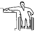
Figure I-1-a: Eye level anthropometrics. (Jones
M.L. 1978)
Note: These are for an "average" woman in a wheelchair.
Children and people with dwarfism would not have this reach or
height. Also people with weakness caused by ALS, MS, MD and other
impairments would have more limited reach.
[insert full page graphic here]
D
 D
D
Figure I-1-b: Normal placement of stove controls poses
serious reach and safety problems for individuals who are very
short or in a wheelchair.
I-2. Maximize the number of people who can ... find the individual
controls/keys if they can't see them.
Problem:
People with visual impairments may be unable to find controls.
Examples:
- Individuals who are severely visually impaired may be unable
to locate controls tactilely because they are on a flat membrane
or glass panel (e.g., calculators, microwave ovens) or because
they are placed too close together or in a complicated arrangement.
- Individuals who have diabetes may have both visual impairments
and failing sensation in fingertips, making it hard to locate
controls that have only subtle tactile cues.
Design Options and Ideas to Consider:
- Varying the size of controls (also texture or shape) with
the most important being larger to facilitate their location and
identification.
- Providing controls whose shapes are associated with their
functions.
- Providing sufficient space between controls for easy tactile
location and identification as well as easier labeling (large
print or braille).
- Locating controls adjacent to what they control.
- Making layout of controls logical and easy to understand,
to facilitate tactile identification (e.g., stove burner controls
in corresponding locations to actual burners).
- Providing a raised lip or ridge around flat (membrane or glass)
panel buttons .
- Providing a (redundant) speech recognition input option.
Additional Information:
- Diameter changes of at least 3/8" and thickness changes
of at least 1/32" are more readily detectable by people who
are blind.
- Vertically arranged controls may be easier for people who
are blind to locate than horizontally arranged controls.
- Voice controls (i.e., controls employing speech recognition)
may be inaccessible for those with speech impairments. Therefore,
if voice control is the only means provided, alternative control/input
methods will need to be available for these people. (See
I-7.)
 D
Keypad on which edge views below are
based.
D
Keypad on which edge views below are
based.
Figure I-2-a: The shape of a key or button can have a significant
effect on people's ability to accurately locate (and operate)
it.

A flat membrane or glass keypad provides no tactile indication
as to where the keys are, even if you memorize the arrangement.

Providing a slight raised lip around the keys allows their location
to be discerned easily by touch. The ridge around the key also
helps prevent slipping off of the key when using a mouthstick,
reacher, etc. to press the keys.

Raised bumps are tactilely discernable but it is harder to press
the key without slipping off, particularly if you are using a
mouthstick, reacher or other manipulative aid.

Raised keys with indents provide better feedback then just indents
(as in example above) especially if the keys have different shapes
or textures which correspond to their function.

Using indentations or hollows on the touchpad provides most of
the advantage of ridges but is easier to clean. Hollows can be
the same size as the key or of a consistent small circular size
centered on the keys. Shallow edges such as those on the left
button are harder to sense with fingers than the sharper curve
of the middle button.
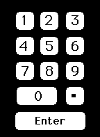
INSTRUCTIONS: For each keyboard below,visually locate the key
on the right hand keyboard that corresponds to the marked key
on the left. Note the increase in speed and accuracy when landmarks
(nibs or breaks in the key patterns) are provided.
First keyboard: No landmarks except edges of keyboard.
Second keyboard: Nibs on keys used as landmarks.
Third keyboard: No landmarks
Fourth keyboard: Spacing used to provide landmarks.
Fifth keyboard: No landmarks
Sixth keyboard: Color or shading used to create landmarks.
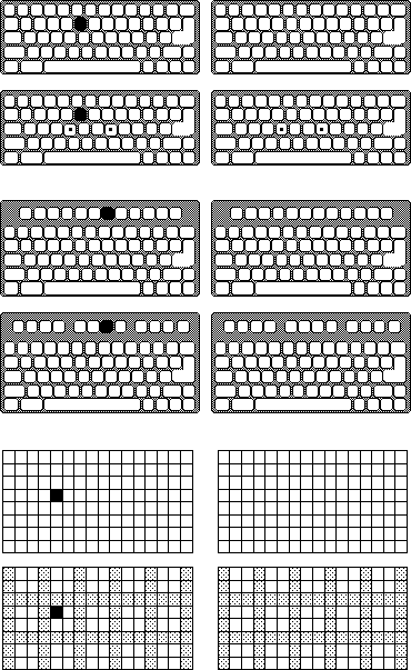 D
D
Figure I-2-b: Quick self-demonstration of the impact of landmarks
on key-finding by people who cannot see labels on a key due to
blindness or very low vision.
[Insert Blurred TV Control Panel Photo Here]
(Photo courtesy of John Ward)
D
Figure I-2-c: Low Vision (blurred) View of a Television Control
Panel
What button would you push to change the channel?
This television's control panel is undecipherable to people with
low vision due to the layout, positioning of the channel vs volume
controls (the buttons next to the channel display do not control
the channel selection... they are the volume control buttons.),
the use of abbreviations, the low contrast of the on/off switch
and lack of a door to cover up the seldom used and confusing setup
controls at the bottom. See Figure I-6-a
for a drawing of this control panel (Answer: the channel control
buttons are the two white triangles in the upper right, next to
the on/off switch.)
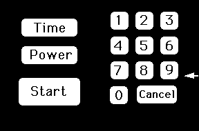
O-4 and O-6
for
related guidelines for output/displays.
Additional Information:
- Lettering which uses most of the key or button surface facilitates
readability.
- Use of bold sans serif typeface is easier for those
with low vision to read.
- Light gray on white and other similar stylish but low contrast
combinations should be avoided.
- One rule of thumb is that no key should be more than one key
away from a tactile landmark. (e.g. a corner, a uniquely shaped
key, a key with a nib, or one of the eight "home" keys
on a keyboard)
- A common approach for providing tactile markings on keyboards
is to put nibs on the front edge of the F and J or D and K keys
as well as on the 5 key on a numeric keypad. This enables users
to operate the keys by "touch."
- Tactile,and/or large print labels could be made available
as stick-on options. These could be raised lettering or braille.
Optional key caps might also be provided for keyboards or buttons.
These caps could have raised lettering or transparent braille
labels.
- Raised lettering should be at least 1/32".
I-4. Maximize the number of people who can ... determine the
status or setting of the controls if they can't see them.
Problem:
Determination of control status or setting may depend solely on
vision.
Example:
- Individuals with visual impairments may be unable to see a
control setting or on/off indicator (e.g., where a dial is set,
whether a button is pushed in, whether a light is on, flashing
or off, or what a numeric setting on a visual display reads).
Design Options and Ideas to Consider:
- Providing multi-sensory indication of the separate divisions,
positions and levels of the controls (e.g. use of detents or clicks
to indicate center position or increments, raised lines, etc).
- Using absolute reference controls (e.g., pointers) rather
than relative controls (e.g., pushbuttons to increase/decrease,
or round, unmarked knobs).
- Using moving pointers with stationary scales.
- Providing multi-sensory indications of control status (e.g.,
in addition to a status light indicating "on," or providing
an intermittent audible tone and/or tactilely discernable vibration).
- Using direct keypad input.
- Providing speech output to read or confirm the setting.
- See O-3, O-4,
and O-5 for design options covering
visual
displays.
Additional Information:
- Absolute reference controls (such as knobs with pointers)
allow the user to determine their settings by directly sensing
the control itself. Relative reference controls (like
up/down volume control buttons, or the dial on a radio) require
the user to view (or listen to) some other display while operating
the control. Relative reference controls are more difficult cognitively
and sensorially.
- Moving pointers and stationary scales (e.g., rotating
pointer with numbers on the panel) are better than moving scales
and a stationary pointer (e.g., rotating knob with numbers on
the knob). A user who is blind or has low vision can use knob
(pointer) position to indicate setting. People with cognitive
impairments can remember knob orientation or scale position rather
than dealing with scale readings. It is also easier to attach
large print, raised letter or braille labels to a stationary scale.
Scales placed directly on a rotating knob are also mostly sideways
or upside down.
- One technique for providing tactile indication of the setting
would be the use of detents, notches, etc. These are
best used with an absolute pointer of some type and a clear tactile
indication of the minimum and maximum settings, as well as what
values those settings may represent. (Two degrees of detents to
indicate large and small divisions on the scale may also be used
to provide more information.)
- Auditory clicks or beeps can indicate positions on
a control but are not as effective as an auditory/tactile click
for people with hearing impairments or for noisy environments.
- Sliding controls are harder for blind users to quickly
read than rotating controls shaped like a pointer. To determine
the setting of a sliding control the person who is blind must
feel the control knob as well as both ends of its travel path
and then tactilely estimate the position of the knob relative
to the two ends.
- Pointers on a knob can take many forms but a pointer
knob with contrast between the pointer and the background provides
maximal visual and tactile feedback as to its setting.
- For many types of input, direct keyboard or numeric keypad
entry may be better than dials, knobs, etc.
Figure I-4-a: The design of a knob can greatly affect its
usability
by people with low vision or blindness. D
| 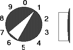 | Side view |
- No non-visual indication of setting. If vision blurred you cannot
tell setting .
- Difficult to put large print or braille labels on knob
- (Also harder to grasp and requires twisting motion)
|
- Highly visible raised pointer
- Instant tactile indication of orientation allows setting to be read
even if user is blind.
- Easy to put larger print or braille labels on back panel.
- Use of detents (large and small) can facilitate inter-numeral
settings.
- Black base disk provides high contrast and helps in control
location/orientation on
panel.
- (Design is also easy to grasp and can be turned by pushing the point
around - no
twisting if the knob turns freely enough)
| |
FOR EXAMPLE: What are the settings of the knobs below?

Figure I-4-b: Knob design can have substantial effect on usability
by people who are blind.
 D
D
POOR: round smooth knob; no tactile orientation cue.

BETTER: has tactile orientation cue but user has
to feel around to find it.

BETTER: orientation cue is less ambiguous. However
the user must still feel the ends to be sure which is the pointer
end.

BEST: has tactile orientation cue which is unambiguous
and can be felt immediately upon grasping knob.
 D
D
Figure I-4-c: Sliding controls can be read but are more difficult
since the person must find the slider and both ends of the range
and then judge the ratio. Raised numbers would help.
 D
D
Figure I-4-d: Keypads allow direct and accurate setting of
controls
even if the person has no sight. However, this type of input is
usually used with a digital display which would be inaccessible
without a voice output option. Large high contrast numbers are helpful
for low vision. A
standard keypad layout is important.
I-5. Maximize the number of people who can ... physically
operate controls and other input mechanisms.
Problem:
Controls (or other input mechanisms) may be difficult or impossible
for those with physical disabilities to operate effectively.
Examples:
- People with severe weakness may be unable to operate controls
at all, or may have great difficulty performing constant, uninterrupted
input.
- People with only one arm or without arms (but utilizing assistive
devices such as headsticks or mouthsticks) may not be able to
activate multiple controls or keys at the same time.
- People with artificial hands or reaching aids may have difficulty
grasping small knobs or operating knobs or switches which require
much force.
- People with poor coordination or impaired muscular control
have slower or irregular reaction times, making time-dependent
input unreliable.
- People lacking fine movement control may be unable to operate
controls requiring accuracy (e.g. a mouse or joystick) or twisting
or complex motions.
- People with limited movement control (including tremor,
incoordination,
or those using headsticks or mouthsticks) can inadvertently bump
extra controls on their way to a nearby desired control.
Design Options and Ideas to Consider:
- Minimizing the need for strength by minimizing force required
as much as possible or by providing adjustable force on mechanical
controls.
- If stiff resistance is provided to prevent accidental activation
it could drop off after activation. Other non-strength related
safety interlocks could also be considered.
- Spacing the controls out to provide a guard space between
controls. This also leaves room for adaptations such as attaching
levers to hard to turn knobs or room to replace knobs with larger,
easier to turn knobs or cranks.
- Minimizing or providing alternatives to performing constant,
uninterrupted actions (e.g., button locks or push on - push off
buttons would eliminate the need to press some buttons continuously).
- Where simultaneous actions are required (e.g., pressing shift
or control key while typing another key) provide an alternative
method to achieve the same result that does not require simultaneous
actions (e.g., sequential option as in StickyKeys - see below).
- Providing for operation with left or right hand.
- Using concave and/or non-slip buttons, which are easier to
use with mouthsticks or headsticks. On flat membrane keypads,
provide a ridge around buttons.
- If product requires a quick response (i.e., a reaction time
of less than 5 seconds, or release of a key or button in less
than 1.5 seconds), allow the user to adjust the time interval
or to have a non-time-dependent alternate input method.
- If product requires fine motor control, then provide an alternate
mechanism for achieving the same objectives that does not require
fine motor control (e.g., on a mouse-based computer, provide a
way to achieve mouse actions from the keyboard).
- Avoiding controls that require twisting or complex motions
(e.g., push and turn). (Note: there are rotating knobs that do
not require twisting.)
- Spacing, positioning and sizing controls to allow manipulation
by individuals with poor motor control or arthritis.
- Where many keys must be located in close proximity, providing
an option that delays the acceptance of input for a preset, adjustable
amount of time (i.e., the key must be held down for the preset
amount of time before it is accepted) helps some users who would
otherwise bump and activate keys on the way to pressing their
desired key. Note: this option must be difficult to accidentally
invoke and be provided on request only, as it can have the effect
of making the keyboard appear to be "broken" to naive
users.
- Making keyboards adjustable from horizontal. (0-15 degrees
is standard.)
- Providing an optional keyguard or keyguard mounting for keyboards.
- Providing optional (redundant) voice control.
- Providing textured controls (avoid slippery surfaces/controls).
Additional Information:
- Accessibility is somewhat less important for those input devices
and controls needed only for periodic adjustment, maintenance,
set-up, or materials replacement aspects of the product (e.g.,
changing ribbons or paper). Where possible, however, it is still
recommended.
- In some instances the force required to operate controls gives
feedback to the user (e.g., a typist knows when a key is pushed
by the force that the key generates against the finger). In such
cases, this feedback should not be removed entirely or substitute
cues provided when force requirements are minimized.
- Use of a keypad is a common technique for providing an alternate
mechanism to fine motor control. "MouseKeys," which
allows the user to drive a mouse cursor around the screen (or
move it one pixel at a time) by using the keypad on a keyboard,
is an example of this.
- StickyKeys is a function which when built into a keyboard
allows users to operate all of the modifier keys (Shift, Control,
etc.) with only a single finger, mouthstick or headstick. Once
it is turned on, you can press the shift key and release it, THEN
press any other key to get the shifted value of the key. Pressing
the shift key twice "locks" the shift key down until
it is pressed a third time. When StickyKeys is turned off it does
not affect normal typing in any way. As a result it can be installed
on standard public access keyboards and remain unnoticed until
needed by a user with a disability (who can quickly invoke it
by tapping the shift key 5 times in a row to wake it up). StickyKeys
(as well as MouseKeys) is provided as a standard feature on all
Macintosh and Apple II computers shipped. Microsoft and IBM also
provide StickyKeys (as well as MouseKeys and other keyboard enhancements)
as a part of an optional access package of extensions for Windows
3.0 and DOS respectively.
- Key design: 25-150 grams of force, preferably adjustable with
tactile and audible feedback, 2-5 mm of travel, 12-15 mm surface
dimensions, 18-20 mm spacing.
- Keyguards for standard computer keyboards are available from
several suppliers.
- Adjustments of time interval should have five or more increments
which vary the time interval.
- One alternative to time dependent input methods is the use
of a keypad which allows direct entry of the desired setting.
- Larger controls are, in general, easier to operate. Large
round controls that have good traction surfaces and turn easily
can often be operated with the side of one's hand.
- If you can attach a post to a twist knob it becomes a crank
and can be operated more easily and without a twisting motion.
If the knob is large, a post might be positionable within the
circumference of the knob. For smaller knobs, an optional extension
rod would provide additional leverage if there is enough room
between knobs.
Comments on some common types of controls: (controls towards
top of list are generally more accessible)
- Rocker switches (concave)
+ good example of push-push switch
+ good feedback for visually impaired users
- Controls all operable from a single keyboard/keypad
+ good, especially if keyboard is repositionable
- Pushbutton controls
+ good for head/mouthstick operation (preferably concave
button requiring less than 100 grams of pressure)
- Double-acting pushbutton controls
+ Push-push controls better than push-pull
- difficult for blind users to tell status unless button
locks in
- Up/down (integrating) control buttons (e.g., volume control
buttons)
+ requires little manipulation
+ best if light action and concave button
- requires monitoring of some other output to determine
setting
- hard for visually impaired users if setting values are displayed
visually
- hard for deaf or hard of hearing users to judge volume (to
others)
- requires person be able to hold hand in place
- requires timing/reaction time
- Sliding or edge-operated controls
+ good for users with physical disabilities
- problem for users who are blind
- may be difficult for users who cannot stabilize their hands to
make fine
adjustments (especially sliding)
- Light action
+ low effort, low fatigue
- can cause multiple activation problems if too close together
- Touch sensitive
- very difficult for person who are blind to locate without
activating.
- must provide some other (auditory or tactile) feedback
for blind users to be able to tell they have activated it.
- heat or capacitive based touch switches may not react
to mouth or headsticks
NOTE: Some diseases such as diabetes and "white finger"
can cause loss of sensation in the fingertips. Therefore, controls
that are dependant on tactile feedback should not rely on fine
tactile sensation.
 D
D
Figure I-5-a: Individuals with arthritis, artificial hands, hooks,
disabilities which restrict wrist rotation, or disabilities which
cause weakness, have difficulty with knobs or controls that require
twisting. Also difficult for people with loss of upper body strength,
range of motion and flexibility as is common with elderly persons.
Really should be avoided in bathrooms where soap and water create
slippery environment. (Lever handles, now required in many building
codes, facilitate access.)
 D
D
Figure I-5-b: Concave and non-slip buttons facilitate the use
of manipulation devices, artificial hands, hooks and mouthsticks.
This is especially true where pressure is required.
I-6. Maximize the number of people who can ... understand
how to operate controls and other input mechanisms.
Problem:
The layout, labeling or method of operating controls and other
input mechanisms can be confusing or unclear.
Examples:
- People with reduced or impaired cognitive function:
- may be confused by complex, cluttered control layouts, with
many and/or many types of controls.
- may have difficulty making selections from large sets.
- may have trouble remembering sequences (see also M-4).
- may be confused by dual-purpose
controls.
- may not relate appropriately to controls settings indicated
solely by notches/dots or numbers.
- People with reduced or impaired cognitive function, language
impairments, illiteracy, or for whom English is a second language:
- may have difficulty relying solely on textual labels, especially
where abbreviations are used, and sometimes have difficulty making
associations between label and control.
- may have trouble with timed responses involving text.
Design Options and Ideas to Consider:
Reducing the number of controls.
- Limiting the number of choices where practical.
- Using layering of controls where only the most frequent or
necessary controls or commands are visible unless you open a door
or ask for additional levels of commands.(e.g. hiding less frequently
used controls, or at least grouping the most frequently used controls
together and placing them prominently.)
- Where possible, make products automatic or self adjusting,
thus removing need for the controls (e.g., TV fine tuning and
horizontal hold).
Simplify the controls.
- Minimizing dual purpose controls.
- Using direct selection techniques where practical (selection
techniques where the person need only make a single, simple,
non-time-dependent
movement to select).
- Using visual/graphic indications for settings along with,
or instead of, numbers or notches/dots (i.e., substitute concrete
indications for abstract indications).
- Reducing or eliminate lag/response times.
- Minimize ambiguity.
- Providing a busy indicator or, preferably, a progress indicator
when a product is busy and cannot take further input or when there
is a delay before the requested action is taken.
- Integrating, grouping and otherwise arranging controls to
indicate function or sequence of operation.
Making labels easy to understand.
- Placing the label on or, less preferably, immediately adjacent
to, the control (this does not apply to scales, which should not
be on the controls but on the background).
- Placing a line around the button and label (or from button
to label) to show association. The line should be kept away from
any lettering especially if it is raised to avoid tactile confusion
with the lettering.
- Using simple concise language.
- Using redundant labeling (e.g., color code plus label).
- Avoiding abbreviations in labeling (e.g., PrtScr, FF, C).
- Leaving space around keys (makes it easier to match labels
to keys and easier to add special labels).
- Using multisensory presentation of feedback information.
- Using inter-interval labeling (see additional information
below).
Reducing, eliminating or providing cues for sequences.
- Allowing use of programmable function keys or using a
"default"
mode.
- Using preprogrammed buttons for common sequences.
- Allowing entry of a short code to program a longer sequence
(e.g., new service with TV Guide and VCR programming - see below).
- Simplifying required sequences, limiting the number of steps.
- Arranging controls to indicate sequence of operation.
- Adding memory cues or simple operating instructions on the
device where possible.
- Cueing required sequences of action.
- Providing an easy exit that returns the user to the original
starting point from any point in the program/sequence. (This exit
should be prominent and clear.)
Building on users' experiences (make the similarity obvious).
- Laying out controls to follow function.
- Making operation of controls follow movement stereotypes (see
below).
- Using common layouts or patterns for controls.
- Using common color coding conventions in addition to textual
or graphic labeling.
- Standardizing - using same shape/color/icon/label for same
function or action. (within and across products and manufacturers.)
Additional Information:
- A new service being introduced across the country provides
a special code number beside each program in the TV Program Listing.
To program your VCR to record that program, all you have to do
is enter that short 4-5 digit number into your VCR. The VCR automatically
calculates the proper day and hours to start and stop the recording
from the number, thus greatly simplifying the VCR programming
process.
- Movement stereotypes are:
| Function | Direction of movement
|
| On | Up, Right, Forward, Clockwise,
Pull
|
| Off | Down, Left, Rearward,
CounterClockwise, Push
|
| Right | Right, Clockwise |
| Left | Left, CounterClockwise
|
| Raise | Up, Back |
| Lower | Down, Forward |
| Increase | Clockwise, Right, Up,
Forward
|
| Decrease | CounterClockwise, Left,
Down, Backward
|
| Extend | Down, Forward, Push
|
| Retract | Up, Rearward, Pull
|
| Hot | Left |
| Cold | Right |
- It is better if controls move in the same plane and direction
as the display or system that they affect (e.g., turning a radio
dial to the right to move station indicator to the right).
- Some common color-coding conventions:
| Light Color | Convention
|
| Red | Malfunction, Stopped, Error
|
| Yellow | Caution, Delay |
| Green | On, Go, Acceptable |
| Blue | Advisory |
| |
| Paint Color | Convention
|
| Red | Stop, Fire, Emergency, Danger,
Hazard, Hot
|
| Orange | Possible Danger |
| Yellow | Caution |
| Green | Go, Safety |
| Blue | Caution, Cold |
- Words and numbers should be redundant wherever possible. If
words and numbers are obliterated can the device still be used?
- On some copy machines the different paper sizes (letter, legal,
ledger) have color coded buttons with corresponding colored rectangles
on the glass (edges).
- Preprinted or blank overlay labels may be offered to allow
the controls to be customized for the individual.
- Abstract symbols (e.g., geometric shapes) can be confusing
when used as the sole labels.
- Use inter-interval labeling wherever possible. A user with
cognitive impairments may not understand that a common setting
such as 150 is halfway between 100 and 200 on a temperature control,
or that 40 minutes is the 2nd mark past 30 on a timer.
- Levers, sliding controls, or dials are easier to understand
than digital displays. (Knowing which way to go from 350 to get
to 450 is mathematical and harder then just moving the pointer
to 450.) However, direct entry of 450 on a keypad may be easier
than a dial - especially for numbers such as 475 that may not
appear directly on the dial or scale.
- Where practical, non-numeric scales are usually easier.
- Representational symbols are easiest to understand, and should
correspond to what they represent as closely as possible (see
below).
- There are different levels of symbol simplicity or iconicity.
On breakdown would be:
- Transparent Symbols - Symbols whose meanings can be
recognized on first appearance. They look like what they mean.
- Standard Symbols - Symbols that would be recognized
because of their common usage.
- Easily Remembered Symbols - Symbols whose meanings
may not be obvious on first sight but whose shape/meaning are
easy to remember once they are known.
- Learned Symbols - Symbols which must be memorized
in order to be remembered.
Type 1 and 2 are obviously the most desirable especially for devices
used in public places or devices which are seldom used. Type 3
or 4 may have to be used for some applications and more involved
or specialized personal devices. Learning the meaning of the symbols
would then have to take place in order to learn the operation
of the device.
Figure I-6-a: This actual television control panel illustrates
poor ergonomic design which would make the Television difficult
to use for everyone, but particularly those with sensory and cognitive
limitations. (See Figure I-2-c for a low vision look at this control
panel)
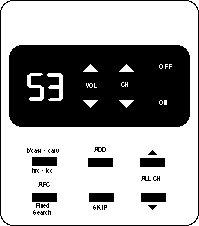 D
D
(all legends, capitalizations, etc., are exactly the same as real
panel)
- The low contrast between the on/off switch and its background
make it virtually invisible
- The channel selector buttons are next to the on/off rather
than the channel display where one would expect them
- The lettering could easily have been larger and bolder making
it less prone to disappearing with poor vision
- Symbols for Volume and Channel could have replaced the word
labels.
- Use of abbreviations makes the panel almost undecipherable.-
Seldom used controls for setting the TV up should be behind a
door where they can't confuse casual users.
I-7. Maximize the number of people who can ... connect special
alternative input devices.
Problem:
Standard controls (or other input mechanisms) cannot be made accessible
for all of those with severe impairments.
Examples:
- People with paralysis of their arms, severe weakness,tremor,
or other severe physical impairments may not be able to use controls
or input mechanisms which require the use of hands.
- Blind individuals cannot use input devices which require constant
eye-hand coordination and visual feedback (e.g., a standard computer
mouse, trackball or touchscreen without special accomodation).
Design Options and Ideas to Consider:
- Providing a standard infra-red remote control (e.g., VCR's,
TV's, stereos).
- Providing alternative means for eye-hand coordination input
devices (e.g., mice, trackballs, relative joysticks), or allow
for special devices to be substituted by the user which will achieve
as many of the functions as possible.
- Providing tactile or auditory cues to allow direct use of
touchpads or techniques to allow touchscreens to function alternately
as auditory or tactile touchpads.
- Providing a standard connection point (connector or infra-red
link) for special alternative input devices (e.g., eye gaze keyboards,
communication aids).
Additional Information:
- Alternate input devices include special keyboards that can
be operated by just looking at the keys, selection panels with
letters and words on them that can be selected by pressing a simple
switch at the right time, and aids that use light pointers attached
to a person's head to point to letters and words to be typed,
etc. These aids often take the form of stand alone communication
aids with voice synthesizers built into them. They can also be
used as input systems to other products as well such as computers
or information systems or any other products with a keyboard or
keypad.
- It is recognized that some activities, such as free-hand sketching
on a computer, cannot be easily done other than with an eye-hand
coordination input device.
- Devices that can be controlled remotely by standard programmable
infra-red controllers provide a convenient means for control by
alternate input aids (e.g. communication aids).
- Programmable infra-red controllers are available which can
be easily connected to and controlled from special communication
and control aids. (via RS-232)
- The wireless nature of these controllers also makes it easy
for people with disabilities to use some products through the
remote controllers without having to reach the products or connect
things to them.
- A standard for low cost bidirectional infra-red data transmission
doesn't currently exist. Creation of such a standard would make
it easier for appliance manufacturers to make display information
available electronically as well as to allow remote and special
devices to be used to control the appliances.
Figure I-7-a: By building a special "SerialKeys" option
into a computers operating system software it is possible for
users who cannot use the standard keyboard and mouse to create
"authentic" keystrokes and mouse movements by sending
signals into the computer's standard serial port. This would allow
these individuals to access the computer and all of its software.
 D
D
- When SerialKeys is turned off the serial port behaves as usual.
- SerialKeys is now available for Macintosh OS, PC & MS-DOS
and MS-Windows.
- Users could also use an infra-red link to connect send their
signals to the serial port on the computer without having to be
physically connected to the computer (see inset).
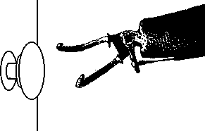
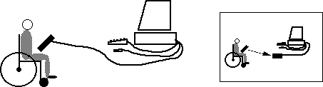
Figure I-7-b: An infra-red bidirectional link could provide
a low cost environment and vandal resistant mechanism for connecting
assistive devices to information, control and transaction terminals.
 D
D
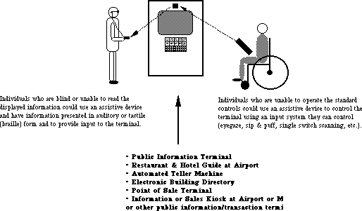
Individuals who are blind or unable to read the displayed information (as
the individual on the left) could use an assistive device to have
information presented in auditory or tactile (braille) form and
to provide input to the terminal.
Individuals who are unable to operate the standard controls (as
the individual on the right) could use an assistive device to
control the terminal using an input system they can control (eyegaze,
sip&puff, single switch scanning, etc.)
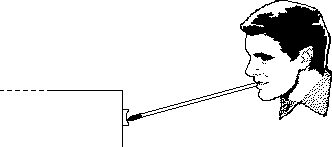
Figure I-7-c: An infra-red link could provide a more effective
way for people with movement limitations to operate automatic
"disability access" doors, and for people with vision
limitations to operate and monitor the progress of elevators and
other public access mechanisms.
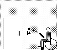 D
D
People who can drive their chairs but not operate the "disability
access" push plates could open the doors with signals from
their assistive devices. Similar ability to access and operate
security keypads and other control panels in a persons environment
would significantly decrease their dependence.
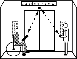
Individuals who cannot reach up and operate controls could operate them
through their
assistive devices.
The same infrared link could also provide information on the current
floor number to
people who are blind.
INPUT& CONTROL EXAMPLES: INTEGRATING THE GUIDELINES
Creating accessible input and control mechanisms that facilitate
use by all people, particularly those with multiple disabilities
requires careful balancing of the considerations. Below are some
examples that demonstrate controls that integrate cross disability
considerations in their design. Others will be added as the guidelines
evolve. In some cases the design has more features than are necessary
or has redundant features in order to demonstrate different possible
combinations.
EXAMPLE 1: Wisconsin #1 Knot
 D
D
- Tactile pointer orientation (setting) can be easily determined
by grasping knob (Low Vision & Blindness).
- High contrast pointer against black backing disk. (Low Vision)
- Red-Orange spot reenforces pointer tip (spot can be illuminated
using plastic lightpipe) (Low Vision ).
- Knob turns easily but is damped to allow turning by pressure
on the side of either end of pointer or by rubbing on the edge
of the back disk. (Physical Impairment)
- Thick back disk is made of high traction plastic to allow
knob to be operated as an edge controlled knob. (Physical Impairment)
- Tactile detents on the major settings. If interscale settings
are important (as on an oven temperature dial) then additional
interscale detents would also be provided. (Low Vision, Blindness,
Physical Impairment)
- Plastic pointer spot on knob can be removed and replaced with
a small post to allow operation of the knob as a crank. (Physical
Impairment)
- Lettering on panel is large, sans-serif, bold and raised.
(Low Vision & Blindness)
- Space is available for optional braille back plate and very
large print backplate. (Low Vision & Blindness)
- Knob setting can be illustrated (in directions) or remembered
solely by visual orientation of knob, ignoring the actual printed
numbers. (Cognitive)
- Space and stationary dial plate allow special labels or pictures
to be attached for non-readers. (Cognitive)
- Numbers are stationary and all upright. (Low Vision, Blindness
& Cognitive)
- Uses clockwise movement convention for increasing values.
(Cognitive)
EXAMPLE 2
Poor Design
 D
D
- Controls not laid out to facilitate understanding if the legends
are not readable.
- On/off button is round and resembles the headphone jack.
- Unclear which button control which functions.
- Low contrast labels.
Better Design
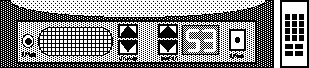
- Volume controls are near the speaker which they affect. Channel
buttons are next to the channel display.
- Headphone jack is also adjacent the speaker.
- Up/down controls are positioned in a manner which suggests/reflects
their function.
- Channel display is large and uses broad stroke, brightly illuminated
characters.
- Photo sensor controls brightness of display to avoid glare
at night or fade-out in daytime.
- Legends are provided and are a higher contrast than above.
- Layout is such that the labels are redundant or fairly obvious
and the function of the controls is therefore easier to remember.
- Infra-Red remote control allows direct entry of channel on
numeric keypad for those whose sight is too poor to see large
display on television.
- Infra-Red remote ability also allows individuals to use special
remote controls including:
- ones with very large letters
- ones with pictures or symbols
- controls connected to special interfaces (e.g. communication
aids, environmental control aids, or computers) for users who
cannot control a standard keypad.
GO to PREVIOUS SECTION -
GO to NEXT SECTION