
|
||
|
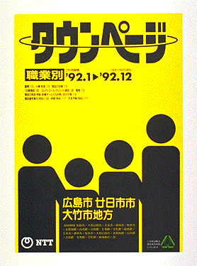
The Town Pages were significantly revamped for the entire country in 1989 (Heisei 1). The color of the cover was changed to yellow and black to conform with international practice and an immediately identifiable, high impact design selected. Inside, the advertising layout was standardized, with advertisements arranged around the listings in a U shape. This provided a convenient layout in which the listings and advertisements could be clearly distinguished. Also, the print color for two-color advertisements was changed from green to red to help catch the readers attention on the yellow Town Pages. | |

|
||