|
|
Aug. 20, 1996
|
Art Watch Index - Aug. 6, 1996
|
|
![]()
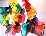
Materials: plastic
This exhibition was organized under the auspice of The International Council of The Museum of Modern Art, New York.
Materials: textile and mixed media
Materials: metal
Hara Museum of Contemporary Art |
In the material world
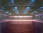
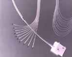
The tactile exhibition requiring physical experience Perhaps due to the recession, the world of product design is not so active. Moreover, the situation has completely changed since the '80's when merely the name of the designer had created a sensation. Now, an exhibition that shakes up such an "ennui" or weary atmosphere has arrived from the United States. It is the exhibition called <<Mutant Materials in Contemporary Design>> held last summer at the Museum of Modern Art in New York, which is shown at the Ozone, Shinjuku Park Tower. The title may be difficult to understand, but it simply means that old and the so-called new materials take on amazing new forms through the designer's ideas and technical innovation. The curator of this exhibition, Paola Antonelli, presents this idea very clearly to us. The displayed works are classified into different materials, such as glass, plastic, metal, wood, fibers and composites, rubber and foam, and ceramics, and the product or its model is placed together in combination with the material sample. Naturally, the sample is placed there for the visitor to touch. The explanation at the side is deliberately unkind, simply listing the designer's name, material name, and the manufacturer. For a moment, one is bewildered, but it probably means he must look at the product, touch the sample, sometimes listen to the sound when he taps on it, and understand the work through his physical experience. From the visitors, one hears exclamations like "Cute!" or "Feels good!" - words we would not usually hear at exhibitions. Interestingly, there was one person who was touching the sample of silicon rubber, not being able to let it go. MoMA, the leader of the movement that brought art into our daily lives The "bendable cutting board" taken up in the "Telecon World" program aired at midnight, the garbage bin we often see at design shops, the Olympus camera designed by Water Studio, and Nike's athletic shoes, were all displayed as contemporary design works at this exhibition. MoMA takes pride as the "shrine" for contemporary art, as well as taking up down-to-earth themes like this exhibition which seem to have nothing to do with art. The leaders of Bauhaus, whose motto was to incorporate art into daily life, came to America during the Second World War, and their ideas gradually penetrated into the pragmatic society. MoMA has always taken the initiative for movements advocating "art in daily life". It is impressive and amazing that in the '60's, the curator, Emilio Ambasz collected well-designed products from town, attached price tags on them and exhibited them in the show, allowing visitors to purchase the products when desired. Innovation of the material and the work of the designer In any way, the modern technical innovation is quite awesome. Designs such as the drinking glass made of plastic formed by ultrasonic processing, and the ultra small-sized telephone head set could not be possible without innovation of materials. From an opposite viewpoint, the work and the positioning of the designer is changing from what we have been imagining. Suggestions from the engineer and the technical strength of thte manufacturer are increasing their contribution to design, thus it cannot be helped that the definition of "design" or "designer" is becoming more vague. Coincidentally, the exhibition of Shiro Kuramata held at the Hara Art Museum marks a clear contrast. Kuramata also pioneered new materials, but he was an artist rather than a designer. Most of the works exhibited at MoMA are created on the assumption of mass consumption in society. For a product to be marketable, demands such as economy, functionality, and durability must be overcome on top of artistic sense. I felt that in design which exists as alchemy of complex factors realized by multiple brains, there may be more potential in today's environment. [Kayoko Ota/Editor]
|
|
|
|
|
BOSNIA.NET http://www.fama.com/ |
Sarajevo and Lacan's "stade de miroir/mirror stage"
The age of Sarajevo and AIDS Today, there are two things that cast shadows on the theater in Europe and the United States. They are AIDS and the war in Sarajevo. Like the films, "Underground" and "Ulysses' Gaze", there are theater that directly refer to Sarajevo, but there are many through which we can feel the "smell" or the presence of such issues. In "Voyageur Immobile" by the Compagnie Philippe Genty, a French puppet theater company who is said to portray the "unconscious" through fantastic scenery (first performance in 1995, performance at the Parco Theater, July, 1996), we can also feel the "smell" of Sarajevo and AIDS. The world depicted by this company is a fantastic one offering intoxicating pleasure through skillful manipulation of the puppets, merging dance and puppet theater in one. They are often said to provide a surrealistic vision. This kind of world gradually changes into something grotesque and cruel, taking us by surprise. In that constant change, we are torn apart by two extremes -- for example being hung in midair between joy and fear. However, we should not connect this theater to AIDS or Sarajevo just because of this aspect. Although "Voyageur Immobile" constantly pushes us back into not a state of intoxication, but an awakened state, through its unique "smell" of death, if that were the only feature of the production, we can call it a theater which takes up death in general, and such a theater had numerously existed in the past. The skin as an object of death However, what appears before us is a puppet theater with a completely different texture. Maybe one could describe it as "crumbling skin". The people [puppeteers/dancers] first appear with paper bandages wrapped around them. Then, those bandages are cut up with, for example, knives and forks, ripped, and dug into, gradually becoming tattered. The fact that the main motif of Philippe Genty's theater starting with the abuse of the human being's "external surface" is death becomes clear to us, and that death being trifled with, expressed as coarse, scab-like skin destroyed into tatters, is not a coincidence. Soon, various kinds of skin fill up the stage. In other words, the skin is not a metaphor of death, but an object. In the end, death is indicated in a more direct form. In the desert, there are instruments that look like chemical plants. The babies (celluloid dolls) are tossed into the air like bullets one after another. After they are caught, they are passed through pipes -- in other words, it is an assembly-line. Finally, the dolls are packed into bags and lined up. Such a "cruel play" undoubtedly brings to mind the gas chambers and mass production of death. Actually, we know very well about the corpses in the bag lined up. Have we not been familiar with such a scene in the news films that are sent from Sarajevo or Rwanda?
Later, explosives are attached to the babies' heads, and set off. Soon, the people involved in the assembly-line work will also end up in the bags. The fantastic world connecting the vague images The ruins of various bodies which appeared in the late 20th century are displayed, captured in various variations of death ceremonies. I cannot help but shudder seeing a production consistently showing specific objects of death as this one. However, in Philippe Genty's vision, this fantastic world is maybe expressed in a more vague image. His unconscious may be only reacting to the world in the form of a chaos. The reason for this is because although Philippe Genty has constructed such an apocalyptic world, he states as follows. "Am I entering the 'stade de miroir/mirror stage' described by Jacques Lacan?" In other words, the vision is wandering among the chaos without achieving self-formation. However, what Lacan is saying is that until that moment, our body remains fragmented within our senses. I think that the vision of a fragmented body is nothing else but the image of the bodies which appear in the age of Sarajevo and AIDS. Which means that we can say the "Voyageur Immobile" is an effort to paradoxically recreate our age in which the skin is destroyed and crumbled, and the body is fragmented, in a fantastic space where the puppets and the human beings blend into each other. [Hidenaga Ootori/Theater Critic]
|
|
|
|
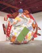
Claes Oldenburg
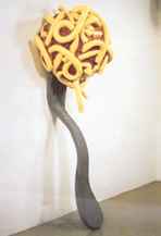
Claes Oldenburg
Claes Oldenburgand Coosje van Bruggen
|
[London]
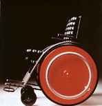
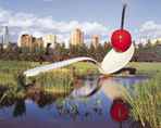
Although most probably it was unintentional on the organizers' part, coincidentally, two exhibitions dealing with the same issue opened in succession at the South Bank of the Thames River in London. One of the exhibitions is Claes Oldenburg's retrospective held at the Hayward Gallery, and the other is a collaborative exhibition held at the Royal Festival Hall called <<Tap, Ruffle and Shave>>, featuring Richard Layzell and other artists. Oldenburg probably does not require any introduction since he is famous for his works which are items taken from everyday commodities magnified into gigantic objects. The exhibition presents his various works ranging from those in the early 1960's to the documentary in which he recorded the process of making a big outdoor installation from the stage of the basic model. This retrospective shows us Oldenburg's interests in the idea of space in daily life and in the issues concerning the city. Perhaps not many people know about Richard Layzell. The concept of this art exhibition, which is a collaboration with the architect, James Engel, and the percussionist from Ghana, Issac Tagoe, is definitely different from other art exhibitions, such as Oldenburg's. Layzell's exhibition presents artworks that are created for children and the handicapped, people who are usually cleverly excluded from art museums. The admission is free. Visitors are called participants, and they are able to touch, tap, and make a sound from objects made of metal, rubber, various kinds of textile, and water. Particular considerations were made for those who are visually handicapped, such as explanations of the works in braille. However, based on studies of sound, light, and tactile perception, works are made so that the delicate "expression" appeals to the senses other than the vision, resulting in something more than just interactive art. This probably comes from Layzell's experience of teaching not only art "appreciation", but also how to create works at actual educational institutions including a school for the visually handicapped in Japan. What is common between the two exhibitions is the question, "For whom does the art museum exist?" Comparing the reaction of the visitors, it is clear that the result is definitely in favor of Layzell. Of course, one could simply ignore Layzell's work by saying that it is not "art". There is no denying, however, that a serious discussion on "what sort of role 'art in parenthesis' can play for the minorities such as children or the handicapped" is necessary. Maybe a new criteria in contemporary art besides "beauty/ugliness" is being required, because the opposition between the two is what has been concealing the confrontation between "the strong and the weak".
[Yoshitaka Mouri/Cultural Studies]
|
|
|
|
|
|
|
|
|
Aug. 20, 1996
|
[home]/[Art Information]/[Column]
[nmp Forum]
Copyright (c) Dai Nippon Printing Co., Ltd. 1996
Network Museum & Magazine Project / nmp@acs.dnp.co.jp
