Accessible Design of Consumer Products
Guidelines for the Design of Consumer Products to Increase
Their Accessibility to People with Disabilties or Who Are Aging
Working Draft 1.7 -- 1992
Compiled for The AD HOC Industry-Consumer-Researcher Work Group
of the Consumer Product Design Guidelines Project by Gregg C.
Vanderheiden and Katherine R. Vanderheiden
Support for the preparation and dissemination of this document
has been provided by the National Institute of Disability and
Rehabilitation Research (NIDRR), US Dept. of Education\ under
grant # G00850036 and by the Assistive Devices Division, Consumer
Electronics Group, Electronic Industries Association.
This document is being sent out specifically for comment and suggested
revisions from industry, consumers and researchers. Please feel
free to mark up, comment, improve or take exception to the document
in any way you see fit and send your comments to us. All responses
and comments can be kept in strict confidence, allowing you to
comment freely as individuals or organizations with anonymity.
Your input is important to this process. Send comments to
CONSUMER PRODUCTS GUIDELINES PROJECT
C/O Trace R & D Center
S-151 Waisman Center
University of Wisconsin - Madison
1500 Highland Ave.
Madison, WI 53705
Attn: Gregg C. Vanderheiden Ph.D.
©1991 Copyright Board of Regents, University of Wisconsin
System
NOTE: To facilitate this document's review and use, you are free
to duplicate and disseminate it freely. You may also excerpt ideas
and materials from it freely. However, please send us a copy of
your work as well for our information and interest.
Some of the charts and concepts in this document are taken from
other authors and publications. These are so marked, and separate
permission must be sought directly from those authors or publications
before use (apart from copying this whole document).
The opinions expressed in this document do not necessarily reflect
the opinions of NIDRR, the Assistive Devices Division of EIA or
the individuals listed as contributors. Nor do all of the opinions
necessarily represent the opinion of the compilers, since this
document represents a compendium of input from many sources.
ABOUT THE PROJECT WORK GROUP
The AD HOC Industry-Consumer-Researcher Work Group is an open
group composed of those individuals interested in more accessible
consumer product design and contributing to the development and
refinement of these guidelines. The work group is headquartered
at the Trace R & D Center at the University of Wisconsin
- Madison. Anyone can join by reviewing, and submitting comments
to correct, elaborate or extend these guidelines. Communications
of the ad hoc work group are carried out by mail to facilitate
participation by industry and consumer representatives who would
not otherwise be able to attend particular meetings or conferences.
To participate in the work group, simply send your comments, ideas,
corrections or extensions to the guidelines to the address on
the cover of this report.
ACKNOWLEDGEMENTS
Many individuals contributed to the development of these guidelines,
both formally and informally, including students who participated
in an Industrial Engineering Department Seminar on Design and
Human Disability and Aging at the University of Wisconsin - Madison.
Among the professionals, consumers, industry representatives and
students contributing to these guidelines are:
Karen Athens
Keith Bednar
Jane Berliss
Lori Beth
Mary Ann Bird
Peter Borden
Eli Chu
Suruedee Chumroum
Raúl Colón
Cynthia Cress
Joanne Deda
Thomas Findley
Jackie Finley
Clint Gibler
Bob Glass
Sue Gmeinder
Paul John Grayson
Mickey Greenberg
Jackie Greshik
Debra A. Griffith
Andy Hesselbach
Ken Jelinek
One-Jang Jeng
Jeff Jentz
Andrea Johnson
Tim Jones
Dennis Jones
Tracy Kidd
Kimberly Kline
Fritz Klode
Jeff Kolff
Yueh-Chuan Kung
Dennis La Buda
Chris LaPorte
Charles Lee
David J. Lee
Seongil Lee
Patti Lindstrom
Fred Lupton
Robert Lynch
Diane Meyers
James Mueller
Young Lae Park
Lawrence Scadden
Joseph Schauer
Debbie Schlais
Lisa Schroeder-Omar
Debbie Sherman
Paul Sura
Jeff Tackes
Sidney Tang
Christine Thompson
Mike Thompson
Michelle S. Vandall
John Ward
Dawn Wadzinski
Steven Wiker
Greg Wierman
Marcy Worzala
Chien-Ling Yang
Thomas Yen
Dave Zehel
A special thanks to Christine J. Thompson, who assisted in the
preparation of many of the graphics in this document.
ABOUT THE AUTHORS
The authors of this document are too numerous and diverse to easily
identify and include the compilers, those listed in the acknowledgements,
those cited in the text and an even greater number of individuals
whose ideas have filtered down through the grapevine and are captured
here. This document represents their ideas as compiled and extended
by Gregg C.Vanderheiden and Katherine R. Vanderheiden.
Gregg Vanderheiden is an associate professor in the Industrial
Engineering Department's Human Factors Program at the University
of Wisconsin-Madison and Director of the Trace Research and Development
Center at the University (a Rehabilitation Engineering Center
focusing on access to communication, computer and electronic devices
by people with disabilities). Dr. Vanderheiden has been active
in the field of technology and disability for over 20 years, has
published numerous papers, chapters and books and has been principal
investigator on over 40 grants and contracts in the area.
Katherine Vanderheiden is an independent business and professional
education consultant. She is a CPA with 10 years experience in
industry, including public accounting, serving as a computer systems
implementation coordinator for a large hospital and developing
training courses and materials for internal and industry use in
her capacity as Manager in the Education Consulting Division of
Arthur Andersen & Co.
CONTENTS
- Background
- Purpose of this Document
- What is Accessible Design?
- Four Ways to Make Products More Accessible
- Direct Accessibility
- Accessibility via Standard Options or Accessories
- Compatibility With Third Party Assistive Devices
- Facilitation of Custom Modifications
- The Best Approach
- Visual Impairments
- Hearing Impairments
- Physical Impairments
- Cognitive/Language Impairments
- Seizure Disorders
- Multiple Impairments
GUIDELINES BY SECTION
Maximize the number of people who can/will ...
O-1 ...hear auditory output clearly enough.
O-2 ...not miss important information if they can't hear.
O-3 ...have line of sight to visual output and can reach printed
O-4 ...see visual output clearly enough.
O-5 ...not miss important information if they can't see.
O-6 ...understand the output (visual, auditory, other)..
O-7 ...view the output display without triggering a seizure.
Maximize the number of people who can ...
I-1 ...reach the controls.
I-2 ...find the individual controls/keys if they can't see them.
I-3 ...read the labels on the controls/keys.
I-4 ...determine the status/setting of the controls if they can't
see them.
I-5 ...physically operate controls and other input mechanisms.
I-6 ...understand how to operate controls and other input mechanisms.
I-7 ...connect special alternative input devices.
Maximize the number of people who can ...
M-1 ...physically insert and/or remove objects as required for
operation.
M-2 ...physically handle and/or open the product.
M-3 ...remove, replace, or reposition often-used detachable parts.
M-4 ...understand how to carry out the manipulations necessary.
Maximize the number of people who can ...
D-1 ...access the documentation.
D-2 ...understand the documentation.
Maximize the number of people who can ...
S-1 ...perceive hazard warnings.
S-2 ...use the product without injury due to unperceived hazards.
Background
Beginning in 1984, joint government/industry efforts have attempted
to address the accessibility of standard computer hardware and
software by people with disabilities. One of the major results
of these efforts was the development of design guidelines for
use by computer manufacturers and software developers
. These guidelines were prepared at the request of the
computer companies to assist them in better understanding accessibility
problems in computer design and to identify commercially practical
strategies for making their products more accessible. The guidelines
were developed using a cooperative
industry-consumer-researcher-government
consortium in order to provide the best information from all angles.
The resulting guidelines (titled: Considerations in
the Design of Computers and Operating Systems to Increase Their
Accessibility to People
with Disabilities) have been used by most major computer
manufacturers
in their ongoing efforts to make their products more accessible
and usable by people with various types and degrees of disability.
The Considerations document is a working document, and as such
is continually evolving and improving (the current version is
4.2).
Purpose of This Document
This document represents a similar cooperative effort to develop
design guidelines for the design of "consumer products."
For this document, consumer products are defined as appliances
and other electronic and mechanical devices available to the mass
market for use in the home, school, office, or for use by the
general public in the community. The purpose of these guidelines
is 1) to point out problems encountered by people with various
disabilities in using standard consumer products, and 2) to propose
design alternatives which will result in increased usability of
standard products by people with disabilities.
As with the computer guidelines, this document is designed to
be purely informational in nature, and has been developed at industry's
request to facilitate product designers' efforts to make their
products more accessible. It represents the compilation of information
from many sources and, as a working document, is under continual
revision. To that end, comments and suggested revisions are solicited
from all readers, particularly from product designers.
What is Accessible Design?
"Accessible Design" is the term used for the
process of extending mass market product design to include people
who, because of personal characteristics or environmental conditions,
find themselves on the low end of some dimension of performance
(e.g., seeing, hearing, reaching, manipulating). Accessible Design
is not (or should not be) separate from standard mass market design.
Rather it is an extension or elaboration of general design principles
to cover a wider range of human abilities/limitations than has
traditionally been included in product design.
Thus Accessible Design is a subset of what is termed Universal
Design. Where Universal Design covers the design of products
for all people and encompasses all design principles, Accessible
Design focuses on principles that extend the standard design process
to those people with some type of performance limitation (the
lower ability tail of Universal Design).
Accessible Design is a balancing act. To begin with, we must acknowledge
that it is not possible to design everything so that
it can be used by everyone. There will always be someone
with a combination of severe physical, sensory and cognitive impairments
who will not be able to use it. However, it is equally unreasonable
to rely on the existence (or development) of special designs for
each major product to accommodate each one of the immense variety
of disabilities (and combinations of disabilities). This makes
it necessary to look toward a combination of approaches for meeting
the needs of people with disabilities, ranging from the incorporation
of features into products that will make them directly usable
("from the box") by more people with disabilities to
the inclusion of features that make them easier to modify for
accessibility.
Four Ways to Make Products More Accessible
Four different approaches to making products more accessible are
discussed in this section and reflected in the Guidelines. In
any one product, it may be necessary to use one or a combination
of these approaches to achieve the desired level of accessibility.
These approaches, in order of desirability, are:
- Direct Accessibility
- Accessibility via Standard Options or Accessories (from the
manufacturer)
- Compatibility with Third Party Assistive Devices
- Facilitation of Custom Modifications
1. Direct Accessibility:
- For most types or degrees of impairment, there are simple
and low cost (or no cost) adaptations to product designs which
can significantly increase their accessibility and usefulness
to individuals with functional impairments. By incorporating these
design modifications into the initial product design, the standard
product can be more accessible directly "out of the box."
- Inclusion of these design features or approaches in the standard
product can be of substantial benefit to society as a whole to
the extent it enables individuals with disabilities to lead more
independent and productive lives. As an additional bonus, it has
often been found that designs which are accessible to people with
more limited abilities may benefit other users (without disabilities
or impairments) as well by reducing fatigue, increasing speed,
decreasing the number of errors made and decreasing learning time.
- Some examples.
In the personal computer industry, particular attention has been
focused on Accessible Design in recent years, and access features
are beginning to show up as direct components of standard computer
products. A "MouseKeys" feature, for example, is now
a standard part of all Apple Macintosh™ computers shipped.
This feature, which can be invoked directly from the keyboard,
allows the user to move the cursor across the screen via the numeric
keypad rather than the mouse. Individuals who do not have the
motor control necessary to operate a mouse can use this feature
(which is built into all Macintoshes) to access the Macintosh.
Because the feature is implemented as an extension to the computer's
operating system, it costs nothing to include as part of the product.
Since "MouseKeys" became available, many able-bodied
users have found it useful as well because of its capability for
precise one-pixel positioning, which was not previously available.
Other examples of direct accessibility include MacDonald's, who
embossed braille characters on the tops of its soft drink cup
covers along with the letters labelling the pushdown buttons on
the lid that indicate whether the drink is diet, etc., and Proctor-Silex,
who embossed braille characters on the bottom of some of its bowls
indicating the size (quarts) of the bowl.
2. Accessibility via Standard Options or Accessories (from
the manufacturer):
- Sometimes it is not possible to design the standard product
to make it directly accessible for some disability populations.
Alternatives to standard design may be identified, but offering
all of them may not be practical due to some alternatives being
mutually exclusive, too expensive, or awkward as a standard product.
- When this occurs, it may be more effective to make these adaptations
or alternatives available as standard options or accessories from
the manufacturer. These may be extra-cost, special order items,
or preferrably, items available free on request. These special
features or accessories should be listed and described in the
standard documentation that comes with the product. They could
also be listed in advertising for the product.
- An example.
Microwave ovens are often made with smooth glass control panels.
That is, there are no tactilely discernable buttons. This can
present a problem for people with visual impairments. Ideally,
the control panel should be designed with ridges around each button
and some type of tactile identification of button function. If
this is not possible, the manufacturer may make available either
a raised letter or braille overlay. These could be available free
upon request. (Information on how to order the optional accessories
should then be prominently presented in the product installation
and operating instructions). The Sharp Carousel II (TM) is one
such microwave that offers a braille overlay as an option.
3. Compatibility With Third Party Assistive Devices:
3a. Compatibility with Special Interfaces or Accessories
- Sometimes direct accessibility, or even the use of standard
options, is impractical for the mass market producer to provide
for all disability types and degrees. This is particularly true
for individuals with severe or multiple impairments (e.g., a person
with a severe physical disability may be unable to use a standard
keyboard even with accessibility features built in). In these
cases, special interfaces or accessories may be available from
third party assistive device manufacturers.
- Some examples.
The mass market manufacturer can facilitate the efforts of third
party manufacturers in a number of ways, including using standard
approaches, providing appropriate connection points, providing
advance access to new versions of products, and providing technical
assistance in understanding and properly attaching accessories
to the product. Consideration in the design of a keyboard, for
example, could make it easier for third parties to develop keyguards
and other keyboard accessories.
3b. Compatibility with General Purpose Assistive Devices
- In some cases, people with particular disabilities may already
have general purpose assistive devices which they would like to
be able to use in conjunction with a product (e.g., a person with
an eye gaze communication aid would like to be able to use it
in conjunction with home electronic appliances; an individual
with artificial hands or a hook would like to be able to operate
the handles on appliance doors; a blind person with a dynamic
braille display would like to use it with home information systems).
Unfortunately, it is often difficult or impossible to connect
the assistive devices to standard products.
- Cooperation between mass manufacturers and assistive device
manufacturers could result in standard or built-in product connection
points (connectors or infra-red links) which facilitate the connection
of special devices as well as properly designed hardware to facilitate
the use of assistive manipulation devices.
- An example.
Many people with physical disabilities cannot use standard computer
keyboards. Some of these people would require more extensive
modifications
than would be possible using the first two accessibility approaches
discussed. Currently, there are assistive device manufacturers
who make alternative input devices to fit people with a variety
of severe physical disabilities. However, the manufacturers of
these assistive devices have always had problems ensuring that
the devices would work with standard, commercially available computers.
As part of the effort by the computer industry to cooperate with
manufacturers of assistive devices, both IBM & Microsoft Corporation
now distribute an extension to their operating systems (DOS &
Windows) called "SerialKeys." This extension allows
people to connect alternative input devices to the serial port
of the standard personal computer in a way which makes input to
the serial port look like it is coming directly from the standard
keyboard and mouse. In this fashion, the user with a disability
can completely access and control the computer and all of its
software from an alternate input system without touching the standard
keyboard or mouse.
4. Facilitation of Custom Modifications:
- There may be some cases where all the other approaches to
Accessible Design prove to be impractical or uneconomical, most
likely for people with combinations or severe disabilities.
- In such cases, custom modifications of the product, either
by the product manufacturer or a third party, may be the best
solution. Standard product manufacturers should facilitate this
as much as they can. For example, leaving room for special attachments
or labels, documenting hooks or places to patch into hardware
or software, publishing information on safe or effective ways
to modify products, or honoring warrantees for products which
have been modified for accessibility but where the modification
did not result in the problem.
- An Example:
After-market adaptation of automobiles (particularly vans) for
use by drivers with physical impairments is being facilitated
in this way. As more standards are developed through cooperative
efforts by auto manufacturers, adaptive specialists, and consumers,
possibilities for help from the auto manufacturers will improve.
Currently, Chrysler pays the first $500 for after-market adaptation
of its vans for people with disabilities. General Motors now pays
up to $1,000 reimbursement of adaptive equipment and installation
costs on eligible vehicles, and provides listings of driver assessment
facilities, mobility equipment dealers, and organizations offering
services in transportation, as well as a GM wheelchair compatibility
listing and resource video.
The Best Approach
Of the four approaches to Accessible Design, the first type, direct
accessibility "from the box," is the best where it is
possible. It allows the greatest access to products by persons
with disabilities at the lowest cost. It also allows them to access
products in public places where they could not otherwise modify
the products to meet their particular needs. It also removes the
stigma of "special" aids or modifications. This is especially
important for older users who do not want to be labeled
"disabled"
even though their abilities are weakening.
It should also be noted that most of us become temporarily
"disabled"
in a number of ways throughout our lives. Sometimes it is by accident,
such as a broken arm or eye injury. Sometimes it is by circumstance,
such as operating things in the dark where we can't see well,
in loud environments (vacuuming or teenagers) where we can't hear
well, with things in our arms where we can't reach well, when
we're tired or on cold medication and can't think well, etc. Only
those products which were designed to be more easily used directly
"from the box" (#1 above) will be of use to us then.
As mentioned above, more accessible designs are also usually easier
to use by everyone all the time - but only if the ease
of use is directly built in.
Prior to reviewing the Guidelines presented in Part III, the reader
who is not familiar with the demographics, causes and effects
of major types of disabilities would benefit greatly from reviewing
this section. The Guidelines assume a basic familiarity with this
information. In addition, it is likely that new advances in design
are not anticipated by the Guidelines. In those cases, knowledge
of the basic characteristics of various disabilities will enable
manufacturers to anticipate the effect of major design changes
on their products' accessibility
A significant portion of our population (over thirty million in
the U.S.) has impairments which reduce their ability to effectively
or safely use standard consumer products. These impairments may
be acquired at birth or through accident or disease. Note that
many impairments which result in disabilities are associated with
aging. This is especially significant, as the population as a
whole is growing older. Although there is a tremendous variety
of specific causes, as well as combinations and severity of disabilities,
we can most easily relate their basic impact to the use of consumer
products by looking at four major categories of impairment. The
four categories are:
- Visual Impairments
- Hearing Impairments
- Physical Impairments
- Cognitive/Language Impairments
In addition, we will discuss the special case of seizure disorders
as well as some of the common situations of multiple impairments.
Visual Impairments
Visual impairment represents a continuum, from people with very
poor vision, to people who can see light but no shapes, to people
who have no perception of light at all. However, for general discussion
it is useful to think of this population as representing two broad
groups: those with low vision and those who are legally blind.
There are an estimated 8.6 million people with visual impairments
(3.4% of the U.S. population). In the elderly population the percentage
of persons with visual impairments is very high.
A person is termed legally blind when their visual acuity
(sharpness of vision) is 20/200 or worse after correction,
or when their field of vision is less than 20 degrees in the best
eye after correction. There are approximately 580,000 people in
the U.S. who are legally blind.
Low vision includes problems (after correction) such
as dimness of vision, haziness, film over the eye, foggy vision,
extreme near- or farsightedness, distortion of vision, spots before
the eyes, color distortions, visual field defects, tunnel vision,
no peripheral vision, abnormal sensitivity to light or glare,
and night blindness. There are approximately 1.8 million people
in the U.S. with severe visual impairments who are not legally
blind.
Many diseases causing severe visual impairments are common in
those who are aging (glaucoma, cataracts, macular degeneration,
and diabetic retinopathy). With current demographic trends toward
a larger proportion of elderly, the incidence of visual impairments
will certainly increase.
Functional Limitations Caused by Visual Impairments
Those who are legally blind may still retain some perception of
shape and contrast or of light vs. dark (the ability to locate
a light source), or they may be totally blind (having no awareness
of environmental light).
Those with visual impairments have the most difficulty with visual
displays and other visual output (e.g., hazard warnings). In addition,
there are problems in utilizing controls where labelling or actual
operation is dependent on vision (e.g., where eye-hand coordination
is required, as with a computer "mouse"). Written operating
instructions and other documentation may be unusable, and there
can be difficulties in manipulation (e.g., insertion/placement,
assembly).
Because many people with visual impairments still have some visual
capability, many of them can read with the assistance of magnifiers,
bright lighting and glare reducers. Many such people with low
vision are helped immensely by use of larger lettering, sans-serif
typefaces, and high contrast coloring.
Those with color blindness may have difficulty differentiating
between certain color pairs. This generally doesn't pose much
of a problem except in those instances when information is color
coded or where color pairs are chosen which result in poor figure
ground contrast.
Key coping strategies for people with more severe visual impairments
include the use of braille and large raised lettering. Note, however,
that braille is preferred by only 10% of blind people (normally
those blind from early in life). Raised lettering must be large
and is therefore better for indicating simple labels than for
extensive text.
Hearing Impairments
Hearing impairment is one of the most prevalent chronic disabilities
in the U.S. Approximately 22 million people in the U.S. (8.2%)
have hearing impairments. Of those, 2.4 million have severe to
profound impairments.
Hearing impairment means any degree and type of auditory disorder,
while deafness means an extreme inability to discriminate
conversational speech through the ear. Deaf people, then, are
those who cannot use their hearing for communication. People with
a lesser degree of hearing impairment are called hard of
hearing.
Usually, a person is considered deaf when sound must reach at
least 90 decibels (5 to 10 times louder than normal speech) to
be heard, and even amplified speech cannot be understood.
Hearing impairments can be found in all age groups, but loss of
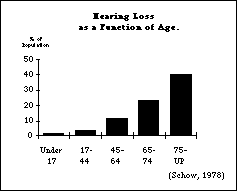
hearing acuity is part of the natural aging process. 23% of those
aged 65 to 74 have hearing impairments, while almost 40% over
age 75 have hearing impairments. The number of individuals with
hearing impairments will increase with the increasing age of the
population and the increase in the severity of noise exposure.
Hearing impairment may be sensorineural or conductive. Sensorineural
hearing loss involves damage to the auditory pathways within
the central nervous system, beginning with the cochlea and auditory
nerve, and including the brain stem and cerebral cortex (this
prevents or disrupts interpretation of the auditory signal).
Conductive
hearing loss is damage to the outer or middle ear which interferes
with sound waves reaching the cochlea. Causes include heredity,
infections, tumors, accidents and aging (presbycusis, or "old
hearing").
Functional Limitations Caused by Hearing Impairments
The primary difficulty for individuals with hearing impairment
in using standard products is receiving auditory information.
This problem can be compensated for by presenting auditory information
redundantly in visual and/or tactile form. If this is not feasible,
an alternative solution to this problem would be to provide a
mechanism, such as a jack, which would allow the user to connect
alternative output devices. Increasing the volume range and lowering
the frequency of products with high pitched auditory output would
be helpful to some less severely impaired individuals. (Progressive
hearing loss usually occurs in higher frequencies first.)
Although not prevalent yet, there is much talk of using voice
input on commercial products in the future. This, too, will present
a problem for many deaf individuals. While many have some residual
speech, which they work to maintain, those who are deaf from birth
or a very early age often are also nonspeaking or have speech
that cannot be recognized using current voice input technology.
Thus, alternatives to voice input will be necessary to these individuals
to access products with voice input.
Familiar coping strategies for hearing impaired people include
the use of hearing aids, sign language, lipreading and TDD's
(telecommunication
devices for the deaf). Some hearing aids are equipped with a
"T-coil"
as well, which provides direct inductive coupling with a second
coil (such as in a telephone receiver) in order to reduce ambient
noise. Some other commercial products could make use of this capability.
ASL (American Sign Language) is commonly used by people who are
deaf. It should be noted, however, that this is a completely different
language from English. Thus, deaf people who primarily use ASL
may understand English only as a second language, and may therefore
not be as proficient with English as native speakers.
Finally, telecommunication devices for the deaf (TDD's) are becoming
more common in households and businesses as a means for deaf and
hard of hearing people to communicate over the phone. TDD's have
always used the Baudot code, but newer ones receive both Baudot
and ASCII.
Physical Impairments
Functional Limitations Caused by Physical Impairments
Problems faced by individuals with physical impairments include
poor muscle control, weakness and fatigue, difficulty walking,
talking, seeing, speaking, sensing or grasping (due to pain or
weakness), difficulty reaching things, and difficulty doing complex
or compound manipulations (push and turn). Individuals with spinal
cord injuries may be unable to use their limbs and may use
"mouthsticks"
for most manipulations. Twisting motions may be difficult or impossible
for people with many types of physical disabilities (including
cerebral palsy, spinal cord injury, arthritis, multiple sclerosis,
muscular dystrophy, etc.).
Some individuals with severe physical disabilities may not be
able to operate even well-designed products directly. These individuals
usually must rely on assistive devices which take advantage of
their specific abilities and on their ability to use these assistive
devices with standard products. Commonly used assistive devices
include mobility aids (e.g., crutches, wheelchairs), manipulation
aids (e.g., prosthetics, orthotics, reachers) communication aids
(e.g., single switch-based artificial voice), and computer/device
interface aids (e.g., eyegaze-operated keyboard).
Nature and Causes of Physical Impairments
Neuromuscular impairments include:
- paralysis (total lack of muscular control in part or most
of the body),
- weakness (paresis; lack of muscle strength, nerve enervation,
or pain), and
- interference with control, via spasticity (where muscles are
tense and contracted), ataxia (problems in accuracy of motor programming
and coordination), and athetosis (extra, involuntary, uncontrolled
and purposeless motion).
Skeletal impairments include joint movement limitations
(either mechanical or due to pain), small limbs,missing limbs,
or abnormal trunk size.
Some major causes of these impairments are:
Arthritis. Arthritis is defined as pain in joints, usually
reducing range of motion and causing weakness. Rheumatoid arthritis
is a chronic syndrome. Osteoarthritis is a degenerative joint
disease. 31.6 million people in the U.S. suffer from rheumatic
disease. The incidence of all forms of arthritis is now estimated
at 900,000 new cases per year.
Cerebral Palsy (CP). Cerebral palsy is defined
as damage to the motor areas of the brain prior to brain maturity
(most cases of CP occur before, during or shortly following birth).
There are more than 750,000 in the U.S. with CP (children and
adults), and 15,000 infants are born each year with CP. CP is
a type of injury, not a disease (although it can be caused by
a disease), and does not get worse over time; it is also not
"curable."
Some causes of cerebral palsy are high temperature, lack of oxygen,
and injury to the head. The most common types are: (1) spastic,
where the individual moves stiffly and with difficulty, (2) ataxic,
characterized by a disturbed sense of balance and depth perception,
and (3) athetoid, characterized by involuntary, uncontrolled motion.
Most cases are combinations of the three types.
Spinal Cord Injury. Spinal cord injury can result
in paralysis or paresis (weakening). The extent of paralysis/paresis
and the parts of the body effected are determined by how high
or low on the spine the damage occurs and the type of damage to
the cord. Quadriplegia involves all four limbs and is caused by
injury to the cervical (upper) region of the spine; paraplegia
involves only the lower extremities and occurs where injury was
below the level of the first thoracic vertebra (mid-lower back).
There are 150,000 to 175,000 people with spinal cord injuries
in the U.S., with projected annual increases of 7,000 - 8,000.
47% of spinal cord injuries result in paraplegia; 53% in quadriplegia.
Car accidents are the most frequent cause (38%), followed by falls
and jumps (16%) and gunshot wounds (13%).
Head Injury (cerebral trauma). The term "head
injury" is used to describe a wide array of injuries, including
concussion, brain stem injury, closed head injury, cerebral hemorrhage,
depressed skull fracture, foreign object (e.g., bullet), anoxia,
and post-operative infections. Like spinal cord injuries, head
injury and also stroke often results in paralysis and paresis,
but there can be a variety of other effects as well. Currently
about one million Americans (1 in 250) suffer from effects of
head injuries, and 400,000 - 600,000 people sustain a head injury
each year. However, many of these are not permanently or severely
disabled.
Stroke (cerebral vascular accident; CVA). The three main
causes of stroke are: thrombosis (blood clot in a blood vessel
blocks blood flow past that point), hemorrhage (resulting in bleeding
into the brain tissue; associated with high blood pressure or
rupture of an aneurism), and embolism (a large clot breaks off
and blocks an artery). The response of brain tissue to injury
is similar whether the injury results from direct trauma (as above)
or from stroke. In either case, function in the area of the brain
affected either stops altogether or is impaired.
Loss of Limbs or Digits (Amputation or Congenital).
This may be due to trauma (e.g., explosions, mangling in a machine,
severance, burns) or surgery (due to cancer, peripheral arterial
disease, diabetes). Usually prosthetics are worn, although these
do not result in full return of function. The National Center
for Health Statistics of the U.S. Public Health Service estimated
a prevalence of 311,000 amputees in 1970. An incidence of approximately
43,000 new amputations per year is estimated, of which 77% occur
in males, and 90% involve the legs. 40% of amputations are above
the knee, 50% are below the knee, and 10% are at the hip.
Parkinson's Disease. This is a progressive disease
of older adults characterized by muscle rigidity, slowness of
movements, and a unique type of tremor. There is no actual paralysis.
The usual age of onset is 50 to 70, and the disease is relatively
common - 187 cases per 100,000.
Multiple Sclerosis (MS). Multiple sclerosis is
defined as a progressive disease of the central nervous system
characterized by the destruction of the insulating material covering
nerve fibers. The problems these individuals experience include
poor muscle control, weakness and fatigue, difficulty walking,
talking, seeing, sensing or grasping objects, and intolerance
of heat. Onset is between the ages of 10 and 40. This is one of
the most common neurological diseases, affecting as many as 500,000
people in the U.S. alone.
ALS (Lou Gehrig's Disease). ALS (Amyotrophic Lateral
Sclerosis) is a fatal degenerative disease of the central nervous
system characterized by slowly progressive paralysis of the voluntary
muscles. The major symptom is progressive muscle weakness involving
the limbs, trunk, breathing muscles, throat and tongue, leading
to partial paralysis and severe speech difficulties. This is not
a rare disease (5 cases per 100,000). It strikes mostly those
between age 30 and 60, and men three times as often as women.
Duration from onset to death is about 1 to 10 years (average 4
years).
Muscular Dystrophy (MD). Muscular dystrophy is
a group of hereditary diseases causing progressive muscular weakness,
loss of muscular control, contractions and difficulty in walking,
breathing, reaching, and use of hands involving strength. About
4 cases in 100,000 are reported.
Cognitive/Language Impairments
Functional Limitations Caused by Cognitive/Language Impairments
The type of cognitive impairment can vary widely, from severe
retardation to inability to remember, to the absence or impairment
of specific cognitive functions (most particularly, language).
Therefore, the types of functional limitations which can result
also vary widely.
Cognitive impairments are varied, but may be categorized as memory,
perception, problem-solving, and conceptualizing disabilities.
Memory problems include difficulty getting information from short-term
storage, long term and remote memory. This includes difficulty
recognizing and retrieving information. Perception problems include
difficulty taking in, attending to, and discriminating sensory
information. Difficulties in problem solving include recognizing
the problem, identifying, choosing and implementing solutions,
and evaluation of outcome. Conceptual difficulties can include
problems in sequencing, generalizing previously learned information,
categorizing, cause and effect, abstract concepts, comprehension
and skill development. Language impairments can cause difficulty
in comprehension and/or expression of written and/or spoken language.
There are very few assistive devices for people with cognitive
impairments. Simple cuing aids or memory aids are sometimes used.
As a rule, these individuals benefit from use of simple displays,
low language loading, use of patterns, simple, obvious sequences
and cued sequences.
Types and Causes of Cognitive/Language Impairments
Mental Retardation. A person is considered mentally
retarded if they have an IQ below 70 (average IQ is 100) and if
they have difficulty functioning independently. An estimated 3%
of Americans are mentally retarded. For most, the cause is unknown,
although infections, Down Syndrome, premature birth, birth trauma,
or lack of oxygen may all cause retardation. Those considered
mildly retarded (80-85%) have an IQ between 55 and 69 and are
considered educable, achieving 4th to 7th grade levels. They usually
function well in the community and hold down semi-skilled and
unskilled jobs. People with moderate retardation (10%) have an
IQ between 40 and 54 and are trainable in educational skills and
independence. They can learn to recognize symbols and simple words,
achieving approximately a 2nd grade level. They often live in
group homes and work in sheltered workshops. People with severe
or profound retardation represent just 5-10% of this population.
Language and Learning Disabilities. Aphasia, an impairment
in the ability to interpret or formulate language symbols as a
result of brain damage, is frequently caused by left cerebral
vascular accident (stroke) or head injury. Specific learning disabilities
are chronic conditions of presumed neurological origin which selectively
interfere with the development, integration, and/or demonstration
of verbal and/or non-verbal abilities. Many people with learning
disabilities are highly intelligent aside from their specific
learning disability. 1-8% of school-aged children and youth have
specific learning disabilities.
Age-Related Disease. Alzheimer's disease is a
degenerative disease that leads to progressive intellectual decline,
confusion and disorientation. Dementia is a brain disease that
results in the progressive loss of mental functions, often beginning
with memory, learning, attention and judgment deficits. The underlying
cause is obstruction of blood flow to the brain. Some kinds of
dementia are curable, while others are not.
Seizure Disorders
A number of injuries or conditions can result in seizure disorders.
Epilepsy is a chronic neurological disorder. It is reported that
approximately 1 person in 15 has a seizure of some sort during
his life, and between .5% and 1.5% of the general population have
chronic, recurring seizures. A seizure consists of an explosive
discharge of nervous tissue, which often starts in one area of
the brain and spreads through the circuits of the brain like an
electrical storm. The seizure discharge activates the circuits
in which it is involved and the function of these circuits will
determine the clinical pattern of the seizure. Except at those
times when this electrical storm is sweeping through it, the brain
is working perfectly well in the person with epilepsy. Seizures
can vary from momentary loss of attention to grand mal seizures
which result in the severe loss of motor control and awareness.
Seizures can be triggered in people with photosensitive epilepsy
by rapidly flashing lights, particularly in the 10 to 25 Hz range.
Multiple Impairments
It is common to find that whatever caused a single type of impairment
also caused others. This is particularly true where disease or
trauma is severe, or in the case of impairments caused by aging.
Deaf-blindness is one commonly identified combination. Most of
these individuals are neither profoundly deaf nor legally blind,
but are both visual and hearing impaired to the extent that strategies
for deafness or blindness alone won't work. People with developmental
disabilities may have a combination of mental and physical impairments
that result in substantial functional limitations in three or
more areas of major life activity. Diabetes, which can cause blindness,
also often causes loss of sensation in the fingers. This makes
braille or raised lettering impossible to read. Cerebral palsy
is often accompanied by visual impairments, by hearing and language
disorders, or by cognitive impairments.
Structure and Organization of the Guidelines
In order to facilitate use by product design teams, this section
is organized functionally rather than by disability area. Functional
categories are as follows:
Output/Displays includes all means
of presenting information to the user
Input/Controls includes keyboards
and all other means of communicating to the product
Manipulations includes all
actions that must be directly performed by a person in concert
with the product or for routine maintenance; e.g., inserting disk,
loading tape, changing ink cartridge
Documentation primarily operating
instructions
Safety includes alarms and protection
from harm
Each guideline is phrased as an objective, followed by a statement
of the problem(s) faced by people with disabilities. The problem
statement is accompanied by more specific examples. Next, "design
options and ideas" are presented to provide some suggestions
as to how the objective could be achieved. Readers are encouraged
to think of other ideas. Finally, additional data and specific
information, along with illustrations, are presented at the end
of each guideline.
The guidelines are stated as generically as possible. Therefore,
all, some or none of the design options and ideas presented may
apply in the case of any specific product. The recommended approach
is to implement those options which together go the longest way
toward achieving the objective of the guideline for your product.
It is understood that this is not an ideal world, so it may currently
be too expensive to implement all those ideas which would
best achieve the objective. It is also anticipated that there
will be other ways of meeting accessibility objectives than those
discussed here, and such discoveries are encouraged. We would
like to hear of them so that they can be included in future releases
of these Guidelines.
Designer's Dilemma: Availability and Meaningfulness of Numbers
In trying to make products more accessible, the question of numbers
quickly arises. How large should lettering be? What size button
is large enough? How much pressure is too much, or not enough?
In trying to make designs more accessible there are two tough
principles that one has to come to grips with early.
- You cannot make a product absolutely accessible.
You
can make it more accessible, but there will
always be people who cannot use it.
- Therefore... There are no magic numbers.
There are no
numbers to tell you that you have gone far enough and nothing
more will help anyone.
At first this is hard to accept. Everyone wants a number to design
to. Occasionally minimal numbers for minimal required accessibility
are set, but ...
- They only can be set for a particular type of device (a phone,
an elevator button, etc.).
Such numbers are not possible for a set of general guidelines
such as these, which relate to all products and all disabilities.
What should be specified as the "ideal knob size" in
a set of guidelines that covers wristwatches, kitchen stoves,
and Walkman™ stereos?
- They only specify a minimum accessibility threshold (usually
required by law or regulation).
They always leave someone out that should be accommodated if possible
in a particular product design.
The Problem with Diversity of Types and Degrees of Impairment
This latter point is the most important. A key problem in picking
or setting a number is deciding who to leave out. The reason for
discussing accessible design in the first place is that the standard
design process currently only targets "most" of the
people, and then stops. Some target number is established that
is "good enough" to cover 80%, 90% or 95% of the people,
and then developers end up designing to that number and stopping
- even if they could just have easily gone a bit further.
And it is that last phrase that is important.
Since no product can be made completely accessible, a designer
can't ever win completely. Tough to accept or deal with, but a
fact of life. The secret, then, is to go as far as one can in
making the design accessible. Setting a number as "good enough"
for "most people with disabilities" and then designing
to it just repeats the mistake that was made in the standard design
process.
For example, to specify exactly how large lettering should be
in order to be visible, you must first ask "visible to whom?"
For any number you cite, there will be people who could see it
if it were just a little bigger and others who would be unable
to read it if you made it any smaller. There would also be some
who could not see it no matter how large you made it. Thus, there
is no number that will allow all people to read it. You always
end up leaving some people off. The question then isn't "How
large must lettering be to be accessible?" The proper question
is "How large can this lettering be and still work for this
product?" The decision to make it as large as practical will
make the product accessible to a greater number of people. However,
the decision as to the exact amount of enlargement that can be
effectively used on the lettering for any given product is a decision
that must be made as a part of the design process for that specific
product.
Numbers Do Have their Place
This is not to say that numbers are not useful. They are essential
to any design process. The numbers needed, however, are not
"target"
numbers or "this is now accessible" numbers, but rather
numbers that a designer can use as milestones to see how changes
in a design will affect users. Whenever data of this type exist
or are identified they will be either included or cited in these
Guidelines. An example of this is Figure O-7-a on the sensitivity
of people with photosensitive epilepsy to different flicker frequencies.
The chart does not give a magic frequency that would be safe (wouldn't
trigger a seizure in anyone) under all conditions. It does, however,
clearly indicate that avoiding 20 hz flicker by as much as practical
will clearly be to the benefit of those with photosensitive epilepsy.
Occasionally, recommended "minimum" or "maximum"
values do exist. Sometimes they are created as part of regulations
or standards which set a baseline that everyone must comply with
for some product or market. In other cases, "rule of thumb"
values exist which are known or believed to cover the majority
of people or situations. As the new accessibility standards for
ADA compliance are finalized, for example, those that might apply
to consumer products will be included in these Guidelines for
reference. In all cases, however, these values should be used
as milestones and not as absolute or "good enough" design
targets. If it is possible to go beyond the value and create a
more accessible design, then that should be considered.
The Role of These Guidelines
The role of these Guidelines, then, is more to raise the awareness
and understanding of designers and to help them ask the right
questions than to provide specific answers or numbers. Notwithstanding,
wherever specific design ideas or "recommendable" values
do exist, they are provided. When they do not, general recommendations
or design ideas are provided to help designers identify areas
where attention can increase accessibility. In addition, data
are provided when available to help designers measure the impact
of various design decisions or tradeoffs.
The Role of the Designer
In all cases, however, the exact values to use for a given product
design will have to be determined by balancing the various design
factors and constraints for that particular product. They cannot
be dictated a priori without picking a number which will
be too restrictive for some designs and unnecessarily loose for
others.
Solomon's Trap
Often, initial attempts at accessible design are done piecemeal.
Accessible features are added where they are obvious rather than
as a result of looking at the product's overall accessibility.
The result can be a design which has accessible parts, but is
not as a whole accessible or usable. Access to half a product
when the rest is inaccessible is of little practical use.
In some cases, inspired by a desire to address the needs of people
with different disabilities, it is even possible to design some
parts of a device (such as the controls) to be more accessible
to one population and design another part of the product with
another disability in mind. Unless the whole product is accessible
to at least one of these populations no-one is served.
In most cases it is possible with careful design to create products
which are simultaneously accessible to people with different impairments.
However, where this is not possible, care should be taken to be
sure that the entire product is accessible to those disability
populations that you are able to address. Giving half a product
to one disability group and the other half of the product to another
is not helpful to or desired by any of the disability groups.
Resolving Conflicting Recommendations
Sometimes a solution to a problem for one type of disability may
cause a new problem for a person with another type of disability.
For example, those with visual impairments may be helped by replacing
a visual readout with auditory output, but this would in turn
cause a problem for those with hearing impairments. As such situations
arise, the Guidelines will attempt to highlight them and suggest
ways to avoid or minimize any potential conflicts.
At the end of most sections, a summary of the recommendations,
along with examples of balanced solutions, is presented. These
are not the only, and perhaps not the best, solutions. They do,
however, show how multiple recommendations can be addressed even
when they seem to be contradictory. They also illustrate that
it is usually impossible to follow all of the recommendations
simultaneously.
NOTE: The ADA guidelines are currently under development and the
ANSI standards for accessibility are currently under revision.
When these activities are completed, specifications for minimum
levels of accessibility for some types of structures and products
will be spelled out. As these minimum values are defined they
will be added to these guidelines in the sections to which they
apply. To avoid confusion existing and proposed standards are
not included in this draft.
SECTION 1: OUTPUT / DISPLAYS. Includes all means of presenting
information
to the user
Maximize the number of people who can/will ...
O-1. Maximize the number of people who can... hear auditory
output clearly enough.
Problem:
Information presented auditorially (e.g., synthesized speech,
cuing and warning beeps, buzzers, tones, machine noises) may not
be effectively heard.
Examples:
- Individuals who have mildly to moderately impaired hearing
may not be able to discern sounds that are too low in volume.
- Individuals who have mild hearing impairments may be unable
to turn the volume up sufficiently in some environments (e.g.,
libraries, where others would be disturbed, or in noisy environments,
where even the highest volume is insufficient).
- People with moderate hearing impairments are often unable
to hear sounds in higher frequencies (above 2000 Hz).
- People with hearing aids may have difficulty separating background
noise from from the desired auditory information.
- People with cognitive impairments may be easily distracted
by too much background noise.
- Auditory information which is short or not repeated or repeatable
(e.g., a short beep or voice message) may be missed or not understood.
NOTE: Severely hearing impaired (and deaf) people cannot use audio
output at all. See O-2 for guideline
to address this problem.
Design Options and Ideas to Consider:
- Providing a volume adjustment, preferably using a visual volume
indicator. Sound should be intelligible (undistorted) throughout
the volume range.
- Making audio output (or volume range if adjustable) as loud
as practical.
- Using sounds which have strong mid-low frequency components
(500 - 3000 Hz).
- Providing a headphone jack to enable a person with impaired
hearing to listen at high volume without disturbing others, to
enable such a person to effectively isolate themselves from background
noise, and to facilitate use of neck loops and special amplifiers
(see additional information below).
- Providing a separate volume control for the headphone jack
so that people without hearing impairments can listen as well
(at standard listening levels).
- When a headphone jack is not possible:
- placing the sound source on the front of the device and away
from loud mechanisms would facilitate hearing.
- locating the speaker on the front of the device would also
facilitate use of a small microphone and amplifier to pick up
and present the information (via speaker, neckloop or vibrator).
- Facilitating the direct use of the telecoil in hearing aids
by incorporating a built-in inductive loop in your product (e.g.,
in telephone receiver's earpiece).
- Reducing the amount of unmeaningful sound produced by the
product (i.e., background noise).
- Presenting auditory information continuously or periodically
until the desired message is confirmed or acted upon. Spoken messages
could automatically repeat or have a mechanism for the user to
ask for them to be repeated.
Additional Information:
- An adjustable and fairly loud volume is particularly
helpful to aging individuals and others with mild hearing impairments
who do not normally carry or use hearing aids or other sound
amplification
devices. (Note that many such people do not wish to acknowledge
their hearing loss by wearing aids.)
- Visual indication of the volume setting is important,
as individuals with hearing impairments often do not know or realize
the volume level is set painfully high for others. Simple strategies
include a painted and/or tactile dot or arrow on a control dial,
a sliding bar volume control, numbers or graphics (on a thumbwheel
dial), or an on-screen bar graph volume indicator (see examples
below).
- Loss of hearing associated with age generally begins with
the inability to hear high frequencies. Thus, use of lower
frequencies will be particularly helpful to older people.
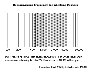
- For alerting devices the use of two or more spectral components
in the 500 - 4500 Hz range is recommended based on ringer studies
. Others suggest limiting the upper frequency to 3000 Hz
to better accommodate people with mid-high frequency loss.
- When using voice output, male voices are usually
preferable to female voices because of their lower pitch. Consonants
which are particularly easy to hear in the male speech patterns
are "m" and "n."
- The use of sufficient volume and low frequency are
particularly critical for alarms.
(See S-1 for guideline to specifically
address this problem.)
- For some products it may be feasible to have adjustable
frequency of auditory output.
- A (front mounted) headphone jack allows individuals
with hearing impairments to carry a pair of headphones or headphones
equipped with a small, battery-operated amplifier to provide the
necessary sound levels.
- Headphone jacks come in two sizes. The commonly used ones
are 1/4" and 1/8 ". Because both are so commonly used,
most headphones come with an adaptor which allows them to work
with both jack sizes. As a result, either size is generally acceptable.
The larger size jack is slightly easier to handle and more rugged
but the smaller size is becoming the more common size due to
miniaturization
of equipment.
- The headphone jack can be used to connect an inductive
neckloop (loop which is worn around the neck and provides
direct inductive coupling with the t-coil in a hearing aid).
- Headphone jacks are also appreciated by non-hearing-impaired
people and people with certain types of learning disabilities
where use of a headphone is desirable for privacy or in both noisy
and quiet environments (e.g., factory, office, or library). A
separate volume control for the headphones is also useful when
others would like to listen to the same output (via speakers)
at a lower volume.
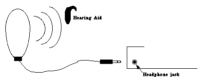 D
D
Figure O-1-a: A
neck ring or ear loop can be plugged into a headphone jack on
an audio source and provide direct inductive coupling between
the audio source and a special induction coil on a person's hearing
aid. This cuts out background noise that would be picked up by
the hearing aid's microphone and provides clearer reception of
the audio signal.
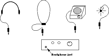 D
D
Figure O-1-b: A headphone
jack permits the connection of headphones, neck/ear loops, amplifiers
or sound indication lights.
 D
D
Figure O-1-c: Speaker
near edge and away from unwanted noise sources allows use of microphone
to pick up sounds and relay on to an amplifier and speaker or
neckloop. (Not as good as headphone jack.)
 D
D
On-screen bar graph (need non-visual method as well); Visual (and
tactile) dot; Sliding
Control with Reference (Not as good for people who are blind).
Figure O-1-d: Provision
of a visual indicator of volume level is useful so that people
with hearing impairments can better judge the impact of volume
on others in the environment.
Figure O-1-e
Hearing Loss as a Function of Age
 D
D
Figure O-1-f
Hearing Loss for Different Frequencies as a Function of Age
 D
D
Figure O-1-g
Recommended Frequency for Altering
Devices
 D
D
O-2. Maximize the number of people who will ... not miss important
information if they can't hear.
Problem:
Audio output (e.g., synthesized speech, cuing and warning beeps,
buzzers, tones) may not be heard at all or may be insufficient
for effectively communicating information.
Examples:
- Individuals who are severely hearing-impaired or deaf may
not hear audio output, even at high volume and low frequencies.
- Individuals with language or cognitive impairments may not
be able to respond to information given only in auditory form.
(This may also be true if the language used is not the primary
language of the individual.)
- Individuals who are deaf-blind may not hear audio output.
- Individuals with standard hearing must sometimes
use products in environments where the sound must be turned off
(libraries) or where the environment is too noisy to hear any
sound output reliably.
Design Options and Ideas to Consider:
- Providing all important auditory information in visual form
as well (or having it available). This includes any speech output
as well as auditory cues and warnings.
- Providing a tactile indication of auditory information.
- Facilitating the connection or use of tactile aids.
- Providing an optional remote audio/visual or tactile indicator.
Additional Information:
- It is understood that those products designed solely for the
purpose of providing audio output (e.g., radios, stereos, CD and
casette players) will not generally be useful to severely
hearing-impaired/deaf
people without special external adaptations. Therefore, it is
not intended that this guideline should apply to such products.
- Some methods for accompanying auditory cues and warnings with
a visual indication would be to blink all or part of the display
screen or any existing light(s) on the product. (Avoid high frequency
flicker - over 2-3 Hz; see O-7.)
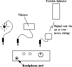
- If it is not possible to provide a redundant visual cue for
the auditory information, a headphone jack would allow the user
to plug in a small LED or light that would provide a visual flicker
whenever sound was emitted from the product's speaker. (For deaf-blind
users a small vibrator could be used.) This would be sufficient
only to indicate that a sound had occurred, not the character
(and therefore possibly the meaning) of the sound if frequency
or timbre were used to convey information.
- When a headphone jack is not provided, the placement of the
sound source near a quiet location and with the speakers facing
the user facilitates the use of a small microphone and amplifier
with a small LED or tactile stimulator (as well as a speaker or
neckloop - see O1).
- Use of a remote audio/visual or tactile indicator (e.g., to
indicate that the washer or dryer in the basement is done) is
useful to all. For example, a small unit might come with an appliance
(like a stove or dryer) which could be carried around with a person
(who will not be in earshot of the appliance) and beep, buzz,
or vibrate when the appliance is "done." Alternately,
the remote indicator could be a small device which plugs into
the wall and is triggered by signals sent over the house wiring
by the appliance (e.g. dryer) to indicate that it is done.
- Any voice output from computers, TV's and other products which
is not also available as printed text on the screen or product
should be available (optionally) through captions on the display
screen. External captioning devices can be connected after the
fact to some devices, but they are expensive and require that
the user carry the devices with them to connect to the products
as they encounter them. They are also practical - or even
possible with public-use products. Built in captioning facilities
are usually very inexpensive and effective. NOTE: After July 26,
1993 all televisions will be required to include built-in caption
decoding circuitry.
 D
D
Figure O-2-a: LED next to speaker gives redundant visual
indication of all
auditory information.
 D
D
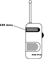
Figure O-2-b: A baby monitor from Fisher-Price provides a visual
indication of
the loudness of the sounds from the baby's room. [ It is advertised as
being useful
"even if you're surrounded by other noises, the TV, the phone, the
vacuum, the
dishwasher..." ]
 D
D
Figure O-2-c: A headphone
jack permits the connection of visual and tactile indicators.
It would also allow the connection of remote alerting devices
which could be carried or positioned in other places in the house.
 D
D
Figure O-2-d: A visual
indication of computer hard disk activity provides the same information
to a person who is deaf that the disk noise provides to those
who can hear. This feature is also useful to hearing users when
the disk drive is silent or there is background noise.
O-3. Maximize the number of people who will ... have line
of sight to visual output and can reach printed output.
Problem:
Visual displays or printouts may be unreadable due to their placement.
Examples:
- Individuals who are in a wheelchair or who are extremely short
may be unable to read displayed information due to the physical
placement or angle of the display screen.
- Individuals in wheelchairs, with missing or paralyzed arms,
or with ability to move limited by cerebral palsy or disease (e.g.,
severe arthritis, MS, ALS, muscular dystrophy) may be unable to
reach printed output (e.g., receipts produced by an Automatic
Teller Machine) due to printer placement.
Design Options and Ideas to Consider:
- Locating display screens so they are readable from varying
heights, including a wheelchair (see I-1
for
specific anthropomorphic data; see O-4 regarding
image height).
- Locating printed output within easy reach of those who are
in wheelchairs.
- Facilitating manipulation of printouts by "reaching and
grasping" aids.
- Providing redundant audio output in addition to visual display
if the visual display cannot be made physically accessible to
an individual in a wheelchair. (See O5.)
Additional Information:
- "Reaching and grasping" aids include: reachers,
artificial hands or hooks, and special mouthsticks with clasps
attached. See figure M-1-f.
- For reach and eye level anthropometrics see Figures I-1-a.
O-4. Maximize the number of people who can ... see visual
output clearly enough.
Problem:
Visual output (e.g., information presented on screens, paper printouts,
cuing and warning lights or dials) may not be effectively seen.
Examples:
- Individuals who are visually impaired may not be able to see
output that is too small.
- Those who are visually impaired may have difficulty discerning
complex typefaces or graphics.
- Individuals who are color blind may not be able to differentiate
between certain color pairs.
- People with poor vision have more difficulty seeing letters/pictures
against a background of similar hue or intensity (low contrast).
- Individuals with visual impairments may be much more sensitive
to glare.
- Those who have visual impairments may not be able to see detail
in low lighting.
- Some people with severe lack of head control (e.g., cerebral
palsy) may not be able to maintain continuous eye contact with
a display, and therefore these individuals may miss portions of
dynamic (i.e., moving, changing) displays.
NOTE: See O-5 for guidelines for people
who cannot use visual output at all. See O-6 for
problems in understanding displayed output.
Design Options and Ideas to Consider:
- Making letters and symbols on visual output as large as
possible/practical.
- Using upper and lowercase type to maximize readability
- Making sure that...
- leading (space between the letters of a word)
- the space between lines
- the distance between messages
- sufficient that the letters and messages to stand out distinctly
from each other.
- Providing adjustable display image size.
- Providing a video jack for attaching larger-image displays
or utilizing special assistive devices (e.g., electronic magnifiers;
see additional information below).
- Using high contrast between text or graphics and background.
- Keeping letters and symbols on visual output as simple as
possible; using sans serif typefaces for non text lettering
(e.g., labels, dials, displays) (see D-1)
- Using only black and white or using colors that vary in intensity
so that the color itself carries no information.
- Providing adjustable color selection (hue and/or intensity).
- Replacing or supplementing color coding with different shape
or relative position coding.
- Providing contrast and/or brightness adjustment.
- Minimizing glare (e.g., by employing filtering devices on
display screens and/or avoiding shiny surfaces and finishes).
- Providing the best possible lighting for displays or areas
containing instrumentation. (good even illumination without hot
spots and brighter than background illumination)
- Providing adjustable speed for dynamic displays (so they can
be slowed down for those who lack motor control).
- Avoiding use of the color blue to convey important information.
(see below)
- Increasing contrast on LCD displays by allowing user to adjust
viewing angle.
Additional Information:
- Contrast controls are important even on monochrome monitors.
- Colors that are of sufficiently different intensity (e.g.,
light yellow vs. dark red) can be distinguishable as different
shades even to a color blind individual.
- The use of glass, chrome and smooth plastics increase the
chance for creating glare.
- The Illuminating Engineering Society recommends very strong
task light to aid in seeing for performance of visual tasks of
low contrast or very small size (e.g., placing a needle on a record,
sewing). If the products are too heavy or cumbersome to bring
to a bright light, easily attachable lights positioned so they
do not produce glare should be used.
- Reduce reflectivity of display screen (quarter-wave coatings
or etched green surfaces preferred to micromesh, polarized or
tinted filters).
- Yellowing of the cornea as we age interferes with the passage
of blue light and can cause confusions between some shades of
blue, green, and violet.
 D
D
Figure O-4-a: Ability to tolerate glare decreases sharply
as a function of age as shown above. Data are based on a 1°
glare source size and a background luminance of 1.6 fl. (Source:
Bennett, 1977a, fig. 1.)
[Insert Chart Here]
D
Figure O-4-b: By avoiding
lines of confusion in the chromatic chart above one can circumvent
problems with the major types of color blindness. For maximum
visibility there should also be a high contrast between the figure
(text) and background.
O-5. Maximize the number of people who will... not miss important
information if they can't see.
Problem:
Visual output (e.g., information presented on screens, paper printouts,
cuing and warning lights, and dials) may not be seen at all by
some users.
Examples:
- Individuals who are severely visually impaired or blind may
not be able to see visual output, even when magnified and clarified
(as recommended in O4).
- Individuals who cannot read may be unable to use visually
presented text.
- Individuals who are deaf and blind may only be able
to perceive tactile output.
- Individuals who do not have any visual impairment may miss
warnings, cues, or other information if it is presented only in
visual form while their attention is diverted.
Design Options and Ideas to Consider:
- Providing all important visual information (redundantly) in
audio and/or tactile form.
- Accompanying visual cues and warnings by a sound, one component
of which is of a mid-low frequency (500-3000 Hz). (See O-
1.)
- Making information which is visually displayed (both text
and graphics) also available electronically at an external connection
point (standard or special port) to facilitate the use of special
assistive devices (e.g., voice synthesizers, braille printers).
Preferably the information would be available in an industry or
company standard format.
Additional Information:
- It is understood that those products designed solely for the
purpose of providing visual output (e.g., slide projectors, cameras)
will not generally be useful to severely visually-impaired/blind
people without special external adaptations. Therefore, it is
not intended that this guideline should necessarily be applied
to such products. It is, however, very useful for people who are
blind to be able to use a copy machine or word processor.
- Note that audio signals which are redundant with visual cues
can also benefit the general user, especially for products which
may be in use some distance from the user (e.g., in the next room)
or where the user's attention may be diverted.
- Some (but not all) people with learning disabilities could
benefit from simultaneously seeing and hearing information.
- All visually displayed information could be provided via voice
synthesizer. The cost for voice output is dropping rapidly. A
small button could be used to turn the voice on or off. (This
can be useful to people who are blind, have low vision, or have
difficulty reading the display. It could also provide cuing or
instructions which would be more than could conveniently be displayed
on a control panel or small display.)
- The external connector could be a standard parallel, serial,
or other I/O port. The data rate of the port should be appropriate
for the amount of data that needs to be transmitted. Products
with small amounts of displayed information could use a low bandwidth
port.
- Serial RS-232 provides a very common, low cost, standard connection
format. Serial data can also be sent via infra-red link. (see
next)
- An inexpensive and unobtrusive approach would be to provide
a small infra-red LED which would transmit the displayed information
via a pulse train of infra-red light. Information could be sent
in ASCII which could be picked up by a device which would translate
the information into voice or braille. This approach allow individuals
to receive information from the product without the user having
to actually connect a special aid to the product. (which is physically
difficult for individuals with physical limitations and requires
people with blindness to locate the proper connection point on
the product). This approach can be very inexpensive to implement
but would require that the user have and carry a receiving device.
This would be reasonable if the technique were used in a widespread
manner. Direct accessibility of the products without an external
device would, however, be superior. (See also I-7
for
infra-red coupling in opposite direction)
- Text information could be provided in ASCII. Graphics information
could be provided via a word description, a character listing
(for character-based screen displays), or a bit image. (See D1.)
- When providing information via text to an auxiliary port there
are at least two different strategies that could be used. One
would be to provide the exact information that is on the display
screen and let the user maneuver about on it (the screen text
image) using their access device. The second approach would be
to send out different (from that displayed on the screen) but
equivalent ASCII text that would provide the same information
as presented on the screen but in a format which was more conducive
to audio presentation. This would allow the use of fuller English
sentences and the presentation of information in a way that would
be more conducive to auditory memory. It would also allow for
the use of a very simple device that would convert IR to text
to speech (or Braille).
- Visual cues and warnings might be accompanied by a distinct
vibration for deaf users who may not be looking at the display
and would miss the cuing beep as well as for deaf-blind users.
See S-1.
 D
D
Figure O-5-a: As the cost
for voice synthesis continues to drop, a "Read Display"
button could be included in appliances that have visual displays
to allow them to be more easily and accurately read by people
with visual impairments (low vision or blindness). For displays
that are set (timers, etc.) the button should be pushable (for
a quick read) or lockable (so that it would read out continually
as it was adjusted).
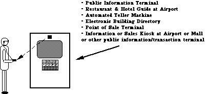 D
D
Figure O-5-b: If
direct accessibility cannot be built in for some reason, an external
connector would allow individuals with special interface devices
to connect them. A relatively low cost and vandal resistant connector
could be provided via an infra-red bidirectional link. Individuals
who are blind or unable to read the displayed information could
then use an assistive device and have information presented in
auditory or tactile (braille) form.
O-6. Maximize the number of people who can ... understand
the output (visual, auditory, other).
Problem:
Visual and/or auditory output may be confusing or hard to understand.
Examples:
- Some people with specific learning disabilities or with reduced
or impaired cognitive abilities:
- are easily confused by complex screen layouts (e.g., multiple
"windows" of information).
- have difficulty understanding complex or sophisticated verbal
(printed or spoken) output.
- have a short attention span, and are easily distracted when
reviewing a screen display.
- For many individuals who are deaf, as well as many other U.S.
citizens, English is a second language and not well understood.
Design Options and Ideas to Consider:
- Using simple screen layouts, or providing the user with the
option to look at one thing at a time.
- Shortening menus.
- Hiding (or layering) seldom used commands or information.
- Keeping language as simple as possible.
- Accompanying words with pictures or icons. (Note, however,
that the use of graphics may present more difficulty for people
who are blind. See O-5.)
- Using Arabic rather than Roman numerals (e.g., use 1, 2, 3
instead of I, II, III).
- Using attention-attracting (e.g. underlining, boldfacing)
and grouping techniques (e.g., putting a box around things
or color blocking).
- Highlighting key information.
- Putting most important information at the beginning of written
text (but not spoken).
- Providing an attention-getting sound or words before audio
presentation.
- Keeping auditory presentations short.
- Having auto-repeat or a means to repeat auditory messages.
- Presenting information in as many (redundant) forms as
possible/practical
(i.e., visual, audio and tactile) or providing as many display
options as possible.
- Providing digital readouts for product generated numbers where
the numeric or precise value is important. Providing dials or
bar graphs where qualitative information is more important (e.g.
half full, full etc). (See I-4 and I-6 for Input/Controls.)
Additional Information:
- To simplify language, try to have each sentence contain only
one clause. Look for an easier way to phrase sentences with more
than one verb. Favor active and affirmative statements over passive
or negative statements (e.g., "The red button controls the
volume" is more direct than "The volume is controlled
by the red button"). Avoid abbreviations (e.g., use stop,
exit, or escape rather than esc).
- Another easy way of simplifying screen layout is to break
up large amounts of text by using double spacing, lots of blank
space, or breaking text into smaller units (paragraphs). If feasible,
allow each section to be called up individually, letting the user
control the reading rate.
[illustration will go here when ready]
D
Figure O-6-a: Displays that use shorter sentences with careful
use of white space, grouping of items, and a logical layout are
easier to understand or interpret than displays that have too
much text that is laid out in one font and block format.
O-7. Maximize the number of people who can ... view the output
display without triggering a seizure.
Problem:
Individuals with seizure sensitivities (e.g., epilepsy) may be
affected by screen cursor or display update frequencies, increasing
the chance of a seizure while working on or near a display screen.
Design Options and Ideas to Consider:
- Avoiding screen refresh or update flicker or flashing frequencies
which are most likely to trigger seizure activity (see chart below).
Additional Information:
- Somewhere between 1 in 25,000 and 1 in 10,000 are affected
by photosensitive epilepsy (i.e., 25,000 - 100,000 people).
- The flash rates most likely to induce convulsions have been
found to be between 10 and 25 hertz, with a peak around 15-20
hertz. (See chart below for example of the relative sensitivity
of individuals to different frequencies.)
- Sensitivity to flicker increases with the intensity of the
light and the portion of the person's visual field which is affected
(e.g., a flickering or flashing screen is much worse than a small
line cursor). Focusing attention on a flashing object would also
increase its effect.
- To avoid screen flicker use 80-100 Hz refresh rate with
decay time approx. 10 ms to 10% luminance level.
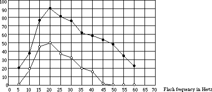 D
D
Figure O-7-a: Percent
of photosensitive patients in whom a photoconvulsive response
was elicited by a 2 second train of flashes with eyes open and
closed. As can be seen, the greatest sensitivity is at 20 Hz with
a steep drop off at higher and lower frequencies. (Jeavons, P.M.,
and Harding, G.F.A. 1975)
SECTION 2: INPUT / CONTROLS. Includes keyboards and all other
means of communicating to the device
Maximize the number of people who can ...
I-1. Maximize the number of people who can ... reach the controls.
Problem:
Controls, keyboards, etc. may be unreachable or unusable.
Examples:
- Individuals who use a wheelchair, who are very weak or who
are extremely short may be unable to reach some controls, keypads,
etc., well enough to use them.
- Individuals with poor motor control may be able to reach the
controls, but may find them too small or close together to accurately
operate the proper knobs, buttons, etc.
- Individuals with severe weakness may be able to reach the
controls, but may find the act of reaching or holding position
in order to manipulate the controls too tiring.
Design Options and Ideas to Consider:
- Locating controls, keyboards, etc. so they are within easy
reach of those who are in wheelchairs or have limited reach.
- Locating controls so that the user can reach and use them
with the least change in body position.
- Locating controls which must be constantly used in the closest
positions possible and where there is wrist or arm support.
- Providing a (redundant) speech recognition input option.
- Offering remote controls (wired, wireless or bus operated).
Additional Information:
- Accessibility to a control becomes less critical if the control
is for an adjustment that is only occasionally used or used only
at setup time.
- Avoid placement that requires the user to lean around the
side or back of the device to see or operate the controls.
- Voice controls (i.e., controls employing speech recognition)
may be inaccessible for those with speech impairments. Therefore,
if voice control is the only means provided, alternative control/input
methods will need to be available for these people. (See
I-
7.)
- Locate controls 36-48" above floor.
- Controls that are located too far apart may require that users
reposition themselves or their wheelchairs each time they move
between controls.
Figure I-1-a: Eye level anthropometrics. (Jones
M.L. 1978)
Note: These are for an "average" woman in a wheelchair.
Children and people with dwarfism would not have this reach or
height. Also people with weakness caused by ALS, MS, MD and other
impairments would have more limited reach.
[insert full page graphic here]
D
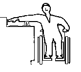 D
D
Figure I-1-b: Normal placement of stove controls poses
serious reach and safety problems for individuals who are very
short or in a wheelchair.
I-2. Maximize the number of people who can ... find the individual
controls/keys if they can't see them.
Problem:
People with visual impairments may be unable to find controls.
Examples:
- Individuals who are severely visually impaired may be unable
to locate controls tactilely because they are on a flat membrane
or glass panel (e.g., calculators, microwave ovens) or because
they are placed too close together or in a complicated arrangement.
- Individuals who have diabetes may have both visual impairments
and failing sensation in fingertips, making it hard to locate
controls that have only subtle tactile cues.
Design Options and Ideas to Consider:
- Varying the size of controls (also texture or shape) with
the most important being larger to facilitate their location and
identification.
- Providing controls whose shapes are associated with their
functions.
- Providing sufficient space between controls for easy tactile
location and identification as well as easier labeling (large
print or braille).
- Locating controls adjacent to what they control.
- Making layout of controls logical and easy to understand,
to facilitate tactile identification (e.g., stove burner controls
in corresponding locations to actual burners).
- Providing a raised lip or ridge around flat (membrane or glass)
panel buttons .
- Providing a (redundant) speech recognition input option.
Additional Information:
- Diameter changes of at least 3/8" and thickness changes
of at least 1/32" are more readily detectable by people who
are blind.
- Vertically arranged controls may be easier for people who
are blind to locate than horizontally arranged controls.
- Voice controls (i.e., controls employing speech recognition)
may be inaccessible for those with speech impairments. Therefore,
if voice control is the only means provided, alternative control/input
methods will need to be available for these people. (See
I-7.)
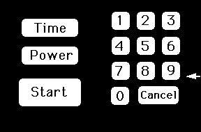 D
Keypad on which edge views below are based.
Figure I-2-a: The shape of a key or button can have a significant
effect on people's ability to accurately locate (and operate)
it.

A flat membrane or glass keypad provides no tactile indication
as to where the keys are, even if you memorize the arrangement.

Providing a slight raised lip around the keys allows their location
to be discerned easily by touch. The ridge around the key also
helps prevent slipping off of the key when using a mouthstick,
reacher, etc. to press the keys.

Raised bumps are tactilely discernable but it is harder to press
the key without slipping off, particularly if you are using a
mouthstick, reacher or other manipulative aid.

Raised keys with indents provide better feedback then just indents
(as in example above) especially if the keys have different shapes
or textures which correspond to their function.

Using indentations or hollows on the touchpad provides most of
the advantage of ridges but is easier to clean. Hollows can be
the same size as the key or of a consistent small circular size
centered on the keys. Shallow edges such as those on the left
button are harder to sense with fingers than the sharper curve
of the middle button.
INSTRUCTIONS: For each keyboard below,visually locate the key
on the right hand keyboard that corresponds to the marked key
on the left. Note the increase in speed and accuracy when landmarks
(nibs or breaks in the key patterns) are provided.
First keyboard: No landmarks except edges of keyboard.
Second keyboard: Nibs on keys used as landmarks.
Third keyboard: No landmarks
Fourth keyboard: Spacing used to provide landmarks.
Fifth keyboard: No landmarks
Sixth keyboard: Color or shading used to create landmarks.
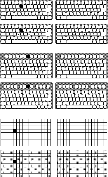 D
D
Figure I-2-b: Quick self-demonstration of the impact of landmarks
on key-finding by people who cannot see labels on a key due to
blindness or very low vision.
[Insert Blurred TV Control Panel Photo Here]
(Photo courtesy of John Ward)
D
Figure I-2-c: Low Vision (blurred) View of a Television Control
Panel
What button would you push to change the channel?
This television's control panel is undecipherable to people with
low vision due to the layout, positioning of the channel vs volume
controls (the buttons next to the channel display do not control
the channel selection... they are the volume control buttons.),
the use of abbreviations, the low contrast of the on/off switch
and lack of a door to cover up the seldom used and confusing setup
controls at the bottom. See Figure I-6-a
for a drawing of this control panel (Answer: the channel control
buttons are the two white triangles in the upper right, next to
the on/off switch.)
O-4 and O-6
for
related guidelines for output/displays.
Additional Information:
- Lettering which uses most of the key or button surface facilitates
readability.
- Use of bold sans serif typeface is easier for those
with low vision to read.
- Light gray on white and other similar stylish but low contrast
combinations should be avoided.
- One rule of thumb is that no key should be more than one key
away from a tactile landmark. (e.g. a corner, a uniquely shaped
key, a key with a nib, or one of the eight "home" keys
on a keyboard)
- A common approach for providing tactile markings on keyboards
is to put nibs on the front edge of the F and J or D and K keys
as well as on the 5 key on a numeric keypad. This enables users
to operate the keys by "touch."
- Tactile,and/or large print labels could be made available
as stick-on options. These could be raised lettering or braille.
Optional key caps might also be provided for keyboards or buttons.
These caps could have raised lettering or transparent braille
labels.
- Raised lettering should be at least 1/32".
I-4. Maximize the number of people who can ... determine the
status or setting of the controls if they can't see them.
Problem:
Determination of control status or setting may depend solely on
vision.
Example:
- Individuals with visual impairments may be unable to see a
control setting or on/off indicator (e.g., where a dial is set,
whether a button is pushed in, whether a light is on, flashing
or off, or what a numeric setting on a visual display reads).
Design Options and Ideas to Consider:
- Providing multi-sensory indication of the separate divisions,
positions and levels of the controls (e.g. use of detents or clicks
to indicate center position or increments, raised lines, etc).
- Using absolute reference controls (e.g., pointers) rather
than relative controls (e.g., pushbuttons to increase/decrease,
or round, unmarked knobs).
- Using moving pointers with stationary scales.
- Providing multi-sensory indications of control status (e.g.,
in addition to a status light indicating "on," or providing
an intermittent audible tone and/or tactilely discernable vibration).
- Using direct keypad input.
- Providing speech output to read or confirm the setting.
- See O-3, O-4,
and O-5 for design options covering
visual
displays.
Additional Information:
- Absolute reference controls (such as knobs with pointers)
allow the user to determine their settings by directly sensing
the control itself. Relative reference controls (like
up/down volume control buttons, or the dial on a radio) require
the user to view (or listen to) some other display while operating
the control. Relative reference controls are more difficult cognitively
and sensorially.
- Moving pointers and stationary scales (e.g., rotating
pointer with numbers on the panel) are better than moving scales
and a stationary pointer (e.g., rotating knob with numbers on
the knob). A user who is blind or has low vision can use knob
(pointer) position to indicate setting. People with cognitive
impairments can remember knob orientation or scale position rather
than dealing with scale readings. It is also easier to attach
large print, raised letter or braille labels to a stationary scale.
Scales placed directly on a rotating knob are also mostly sideways
or upside down.
- One technique for providing tactile indication of the setting
would be the use of detents, notches, etc. These are
best used with an absolute pointer of some type and a clear tactile
indication of the minimum and maximum settings, as well as what
values those settings may represent. (Two degrees of detents to
indicate large and small divisions on the scale may also be used
to provide more information.)
- Auditory clicks or beeps can indicate positions on
a control but are not as effective as an auditory/tactile click
for people with hearing impairments or for noisy environments.
- Sliding controls are harder for blind users to quickly
read than rotating controls shaped like a pointer. To determine
the setting of a sliding control the person who is blind must
feel the control knob as well as both ends of its travel path
and then tactilely estimate the position of the knob relative
to the two ends.
- Pointers on a knob can take many forms but a pointer
knob with contrast between the pointer and the background provides
maximal visual and tactile feedback as to its setting.
- For many types of input, direct keyboard or numeric keypad
entry may be better than dials, knobs, etc.
Figure I-4-a: The design of a knob can greatly affect its
usability
by people with low vision or blindness.
D
 |  | Side
view |
- No non-visual indication of setting. If vision blurred you cannot
tell setting .
- Difficult to put large print or braille labels on knob
- (Also harder to grasp and requires twisting motion)
|
- Highly visible raised pointer
- Instant tactile indication of orientation allows setting to be read
even if user is blind.
- Easy to put larger print or braille labels on back panel.
- Use of detents (large and small) can facilitate inter-numeral
settings.
- Black base disk provides high contrast and helps in control
location/orientation on
panel.
- (Design is also easy to grasp and can be turned by pushing the point
around - no
twisting if the knob turns freely enough)
| |
FOR EXAMPLE: What are the settings of the knobs below?

Figure I-4-b: Knob design can have substantial effect on usability
by people who are blind.
 D
D
POOR: round smooth knob; no tactile orientation cue.

BETTER: has tactile orientation cue but user has
to feel around to find it.

BETTER: orientation cue is less ambiguous. However
the user must still feel the ends to be sure which is the pointer
end.

BEST: has tactile orientation cue which is unambiguous
and can be felt immediately upon grasping knob.
 D
D
Figure I-4-c: Sliding controls can be read but are more difficult
since the person must find the slider and both ends of the range
and then judge the ratio. Raised numbers would help.
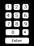 D
D
Figure I-4-d: Keypads allow direct and accurate setting of
controls
even if the person has no sight. However, this type of input is
usually used with a digital display which would be inaccessible
without a voice output option. Large high contrast numbers are helpful
for low vision. A
standard keypad layout is important.
I-5. Maximize the number of people who can ... physically
operate controls and other input mechanisms.
Problem:
Controls (or other input mechanisms) may be difficult or impossible
for those with physical disabilities to operate effectively.
Examples:
- People with severe weakness may be unable to operate controls
at all, or may have great difficulty performing constant, uninterrupted
input.
- People with only one arm or without arms (but utilizing assistive
devices such as headsticks or mouthsticks) may not be able to
activate multiple controls or keys at the same time.
- People with artificial hands or reaching aids may have difficulty
grasping small knobs or operating knobs or switches which require
much force.
- People with poor coordination or impaired muscular control
have slower or irregular reaction times, making time-dependent
input unreliable.
- People lacking fine movement control may be unable to operate
controls requiring accuracy (e.g. a mouse or joystick) or twisting
or complex motions.
- People with limited movement control (including tremor,
incoordination,
or those using headsticks or mouthsticks) can inadvertently bump
extra controls on their way to a nearby desired control.
Design Options and Ideas to Consider:
- Minimizing the need for strength by minimizing force required
as much as possible or by providing adjustable force on mechanical
controls.
- If stiff resistance is provided to prevent accidental activation
it could drop off after activation. Other non-strength related
safety interlocks could also be considered.
- Spacing the controls out to provide a guard space between
controls. This also leaves room for adaptations such as attaching
levers to hard to turn knobs or room to replace knobs with larger,
easier to turn knobs or cranks.
- Minimizing or providing alternatives to performing constant,
uninterrupted actions (e.g., button locks or push on - push off
buttons would eliminate the need to press some buttons continuously).
- Where simultaneous actions are required (e.g., pressing shift
or control key while typing another key) provide an alternative
method to achieve the same result that does not require simultaneous
actions (e.g., sequential option as in StickyKeys - see below).
- Providing for operation with left or right hand.
- Using concave and/or non-slip buttons, which are easier to
use with mouthsticks or headsticks. On flat membrane keypads,
provide a ridge around buttons.
- If product requires a quick response (i.e., a reaction time
of less than 5 seconds, or release of a key or button in less
than 1.5 seconds), allow the user to adjust the time interval
or to have a non-time-dependent alternate input method.
- If product requires fine motor control, then provide an alternate
mechanism for achieving the same objectives that does not require
fine motor control (e.g., on a mouse-based computer, provide a
way to achieve mouse actions from the keyboard).
- Avoiding controls that require twisting or complex motions
(e.g., push and turn). (Note: there are rotating knobs that do
not require twisting.)
- Spacing, positioning and sizing controls to allow manipulation
by individuals with poor motor control or arthritis.
- Where many keys must be located in close proximity, providing
an option that delays the acceptance of input for a preset, adjustable
amount of time (i.e., the key must be held down for the preset
amount of time before it is accepted) helps some users who would
otherwise bump and activate keys on the way to pressing their
desired key. Note: this option must be difficult to accidentally
invoke and be provided on request only, as it can have the effect
of making the keyboard appear to be "broken" to naive
users.
- Making keyboards adjustable from horizontal. (0-15 degrees
is standard.)
- Providing an optional keyguard or keyguard mounting for keyboards.
- Providing optional (redundant) voice control.
- Providing textured controls (avoid slippery surfaces/controls).
Additional Information:
- Accessibility is somewhat less important for those input devices
and controls needed only for periodic adjustment, maintenance,
set-up, or materials replacement aspects of the product (e.g.,
changing ribbons or paper). Where possible, however, it is still
recommended.
- In some instances the force required to operate controls gives
feedback to the user (e.g., a typist knows when a key is pushed
by the force that the key generates against the finger). In such
cases, this feedback should not be removed entirely or substitute
cues provided when force requirements are minimized.
- Use of a keypad is a common technique for providing an alternate
mechanism to fine motor control. "MouseKeys," which
allows the user to drive a mouse cursor around the screen (or
move it one pixel at a time) by using the keypad on a keyboard,
is an example of this.
- StickyKeys is a function which when built into a keyboard
allows users to operate all of the modifier keys (Shift, Control,
etc.) with only a single finger, mouthstick or headstick. Once
it is turned on, you can press the shift key and release it, THEN
press any other key to get the shifted value of the key. Pressing
the shift key twice "locks" the shift key down until
it is pressed a third time. When StickyKeys is turned off it does
not affect normal typing in any way. As a result it can be installed
on standard public access keyboards and remain unnoticed until
needed by a user with a disability (who can quickly invoke it
by tapping the shift key 5 times in a row to wake it up). StickyKeys
(as well as MouseKeys) is provided as a standard feature on all
Macintosh and Apple II computers shipped. Microsoft and IBM also
provide StickyKeys (as well as MouseKeys and other keyboard enhancements)
as a part of an optional access package of extensions for Windows
3.0 and DOS respectively.
- Key design: 25-150 grams of force, preferably adjustable with
tactile and audible feedback, 2-5 mm of travel, 12-15 mm surface
dimensions, 18-20 mm spacing.
- Keyguards for standard computer keyboards are available from
several suppliers.
- Adjustments of time interval should have five or more increments
which vary the time interval.
- One alternative to time dependent input methods is the use
of a keypad which allows direct entry of the desired setting.
- Larger controls are, in general, easier to operate. Large
round controls that have good traction surfaces and turn easily
can often be operated with the side of one's hand.
- If you can attach a post to a twist knob it becomes a crank
and can be operated more easily and without a twisting motion.
If the knob is large, a post might be positionable within the
circumference of the knob. For smaller knobs, an optional extension
rod would provide additional leverage if there is enough room
between knobs.
Comments on some common types of controls: (controls towards
top of list are generally more accessible)
- Rocker switches (concave)
+ good example of push-push switch
+ good feedback for visually impaired users
- Controls all operable from a single keyboard/keypad
+ good, especially if keyboard is repositionable
- Pushbutton controls
+ good for head/mouthstick operation (preferably concave
button requiring less than 100 grams of pressure)
- Double-acting pushbutton controls
+ Push-push controls better than push-pull
- difficult for blind users to tell status unless button
locks in
- Up/down (integrating) control buttons (e.g., volume control
buttons)
+ requires little manipulation
+ best if light action and concave button
- requires monitoring of some other output to determine
setting
- hard for visually impaired users if setting values are displayed
visually
- hard for deaf or hard of hearing users to judge volume (to
others)
- requires person be able to hold hand in place
- requires timing/reaction time
- Sliding or edge-operated controls
+ good for users with physical disabilities
- problem for users who are blind
- may be difficult for users who cannot stabilize their hands to
make fine
adjustments (especially sliding)
- Light action
+ low effort, low fatigue
- can cause multiple activation problems if too close together
- Touch sensitive
- very difficult for person who are blind to locate without
activating.
- must provide some other (auditory or tactile) feedback
for blind users to be able to tell they have activated it.
- heat or capacitive based touch switches may not react
to mouth or headsticks
NOTE: Some diseases such as diabetes and "white finger"
can cause loss of sensation in the fingertips. Therefore, controls
that are dependant on tactile feedback should not rely on fine
tactile sensation.
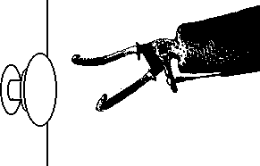 D
D
Figure I-5-a: Individuals with arthritis, artificial hands, hooks,
disabilities which restrict wrist rotation, or disabilities which
cause weakness, have difficulty with knobs or controls that require
twisting. Also difficult for people with loss of upper body strength,
range of motion and flexibility as is common with elderly persons.
Really should be avoided in bathrooms where soap and water create
slippery environment. (Lever handles, now required in many building
codes, facilitate access.)
 D
D
Figure I-5-b: Concave and non-slip buttons facilitate the use
of manipulation devices, artificial hands, hooks and mouthsticks.
This is especially true where pressure is required.
I-6. Maximize the number of people who can ... understand
how to operate controls and other input mechanisms.
Problem:
The layout, labeling or method of operating controls and other
input mechanisms can be confusing or unclear.
Examples:
- People with reduced or impaired cognitive function:
- may be confused by complex, cluttered control layouts, with
many and/or many types of controls.
- may have difficulty making selections from large sets.
- may have trouble remembering sequences (see also M-4).
- may be confused by dual-purpose
controls.
- may not relate appropriately to controls settings indicated
solely by notches/dots or numbers.
- People with reduced or impaired cognitive function, language
impairments, illiteracy, or for whom English is a second language:
- may have difficulty relying solely on textual labels, especially
where abbreviations are used, and sometimes have difficulty making
associations between label and control.
- may have trouble with timed responses involving text.
Design Options and Ideas to Consider:
Reducing the number of controls.
- Limiting the number of choices where practical.
- Using layering of controls where only the most frequent or
necessary controls or commands are visible unless you open a door
or ask for additional levels of commands.(e.g. hiding less frequently
used controls, or at least grouping the most frequently used controls
together and placing them prominently.)
- Where possible, make products automatic or self adjusting,
thus removing need for the controls (e.g., TV fine tuning and
horizontal hold).
Simplify the controls.
- Minimizing dual purpose controls.
- Using direct selection techniques where practical (selection
techniques where the person need only make a single, simple,
non-time-dependent
movement to select).
- Using visual/graphic indications for settings along with,
or instead of, numbers or notches/dots (i.e., substitute concrete
indications for abstract indications).
- Reducing or eliminate lag/response times.
- Minimize ambiguity.
- Providing a busy indicator or, preferably, a progress indicator
when a product is busy and cannot take further input or when there
is a delay before the requested action is taken.
- Integrating, grouping and otherwise arranging controls to
indicate function or sequence of operation.
Making labels easy to understand.
- Placing the label on or, less preferably, immediately adjacent
to, the control (this does not apply to scales, which should not
be on the controls but on the background).
- Placing a line around the button and label (or from button
to label) to show association. The line should be kept away from
any lettering especially if it is raised to avoid tactile confusion
with the lettering.
- Using simple concise language.
- Using redundant labeling (e.g., color code plus label).
- Avoiding abbreviations in labeling (e.g., PrtScr, FF, C).
- Leaving space around keys (makes it easier to match labels
to keys and easier to add special labels).
- Using multisensory presentation of feedback information.
- Using inter-interval labeling (see additional information
below).
Reducing, eliminating or providing cues for sequences.
- Allowing use of programmable function keys or using a
"default"
mode.
- Using preprogrammed buttons for common sequences.
- Allowing entry of a short code to program a longer sequence
(e.g., new service with TV Guide and VCR programming - see below).
- Simplifying required sequences, limiting the number of steps.
- Arranging controls to indicate sequence of operation.
- Adding memory cues or simple operating instructions on the
device where possible.
- Cueing required sequences of action.
- Providing an easy exit that returns the user to the original
starting point from any point in the program/sequence. (This exit
should be prominent and clear.)
Building on users' experiences (make the similarity obvious).
- Laying out controls to follow function.
- Making operation of controls follow movement stereotypes (see
below).
- Using common layouts or patterns for controls.
- Using common color coding conventions in addition to textual
or graphic labeling.
- Standardizing - using same shape/color/icon/label for same
function or action. (within and across products and manufacturers.)
Additional Information:
- A new service being introduced across the country provides
a special code number beside each program in the TV Program Listing.
To program your VCR to record that program, all you have to do
is enter that short 4-5 digit number into your VCR. The VCR automatically
calculates the proper day and hours to start and stop the recording
from the number, thus greatly simplifying the VCR programming
process.
- Movement stereotypes are:
| Function | Direction of movement
|
| On | Up, Right, Forward, Clockwise,
Pull
|
| Off | Down, Left, Rearward,
CounterClockwise, Push
|
| Right | Right, Clockwise |
| Left | Left, CounterClockwise
|
| Raise | Up, Back |
| Lower | Down, Forward |
| Increase | Clockwise, Right, Up,
Forward
|
| Decrease | CounterClockwise, Left,
Down, Backward
|
| Extend | Down, Forward, Push
|
| Retract | Up, Rearward, Pull
|
| Hot | Left |
| Cold | Right |
- It is better if controls move in the same plane and direction
as the display or system that they affect (e.g., turning a radio
dial to the right to move station indicator to the right).
- Some common color-coding conventions:
| Light Color | Convention
|
| Red | Malfunction, Stopped, Error
|
| Yellow | Caution, Delay |
| Green | On, Go, Acceptable |
| Blue | Advisory |
| |
| Paint Color | Convention
|
| Red | Stop, Fire, Emergency, Danger,
Hazard, Hot
|
| Orange | Possible Danger |
| Yellow | Caution |
| Green | Go, Safety |
| Blue | Caution, Cold |
- Words and numbers should be redundant wherever possible. If
words and numbers are obliterated can the device still be used?
- On some copy machines the different paper sizes (letter, legal,
ledger) have color coded buttons with corresponding colored rectangles
on the glass (edges).
- Preprinted or blank overlay labels may be offered to allow
the controls to be customized for the individual.
- Abstract symbols (e.g., geometric shapes) can be confusing
when used as the sole labels.
- Use inter-interval labeling wherever possible. A user with
cognitive impairments may not understand that a common setting
such as 150 is halfway between 100 and 200 on a temperature control,
or that 40 minutes is the 2nd mark past 30 on a timer.
- Levers, sliding controls, or dials are easier to understand
than digital displays. (Knowing which way to go from 350 to get
to 450 is mathematical and harder then just moving the pointer
to 450.) However, direct entry of 450 on a keypad may be easier
than a dial - especially for numbers such as 475 that may not
appear directly on the dial or scale.
- Where practical, non-numeric scales are usually easier.
- Representational symbols are easiest to understand, and should
correspond to what they represent as closely as possible (see
below).
- There are different levels of symbol simplicity or iconicity.
On breakdown would be:
- Transparent Symbols - Symbols whose meanings can be
recognized on first appearance. They look like what they mean.
- Standard Symbols - Symbols that would be recognized
because of their common usage.
- Easily Remembered Symbols - Symbols whose meanings
may not be obvious on first sight but whose shape/meaning are
easy to remember once they are known.
- Learned Symbols - Symbols which must be memorized
in order to be remembered.
Type 1 and 2 are obviously the most desirable especially for devices
used in public places or devices which are seldom used. Type 3
or 4 may have to be used for some applications and more involved
or specialized personal devices. Learning the meaning of the symbols
would then have to take place in order to learn the operation
of the device.
Figure I-6-a: This actual television control panel illustrates
poor ergonomic design which would make the Television difficult
to use for everyone, but particularly those with sensory and cognitive
limitations. (See Figure I-2-c for a low vision look at this control
panel)
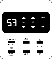 D
(all legends, capitalizations, etc., are exactly the same as real
panel)
- The low contrast between the on/off switch and its background
make it virtually invisible
- The channel selector buttons are next to the on/off rather
than the channel display where one would expect them
- The lettering could easily have been larger and bolder making
it less prone to disappearing with poor vision
- Symbols for Volume and Channel could have replaced the word
labels.
- Use of abbreviations makes the panel almost undecipherable.-
Seldom used controls for setting the TV up should be behind a
door where they can't confuse casual users.
I-7. Maximize the number of people who can ... connect special
alternative input devices.
Problem:
Standard controls (or other input mechanisms) cannot be made accessible
for all of those with severe impairments.
Examples:
- People with paralysis of their arms, severe weakness,tremor,
or other severe physical impairments may not be able to use controls
or input mechanisms which require the use of hands.
- Blind individuals cannot use input devices which require constant
eye-hand coordination and visual feedback (e.g., a standard computer
mouse, trackball or touchscreen without special accomodation).
Design Options and Ideas to Consider:
- Providing a standard infra-red remote control (e.g., VCR's,
TV's, stereos).
- Providing alternative means for eye-hand coordination input
devices (e.g., mice, trackballs, relative joysticks), or allow
for special devices to be substituted by the user which will achieve
as many of the functions as possible.
- Providing tactile or auditory cues to allow direct use of
touchpads or techniques to allow touchscreens to function alternately
as auditory or tactile touchpads.
- Providing a standard connection point (connector or infra-red
link) for special alternative input devices (e.g., eye gaze keyboards,
communication aids).
Additional Information:
- Alternate input devices include special keyboards that can
be operated by just looking at the keys, selection panels with
letters and words on them that can be selected by pressing a simple
switch at the right time, and aids that use light pointers attached
to a person's head to point to letters and words to be typed,
etc. These aids often take the form of stand alone communication
aids with voice synthesizers built into them. They can also be
used as input systems to other products as well such as computers
or information systems or any other products with a keyboard or
keypad.
- It is recognized that some activities, such as free-hand sketching
on a computer, cannot be easily done other than with an eye-hand
coordination input device.
- Devices that can be controlled remotely by standard programmable
infra-red controllers provide a convenient means for control by
alternate input aids (e.g. communication aids).
- Programmable infra-red controllers are available which can
be easily connected to and controlled from special communication
and control aids. (via RS-232)
- The wireless nature of these controllers also makes it easy
for people with disabilities to use some products through the
remote controllers without having to reach the products or connect
things to them.
- A standard for low cost bidirectional infra-red data transmission
doesn't currently exist. Creation of such a standard would make
it easier for appliance manufacturers to make display information
available electronically as well as to allow remote and special
devices to be used to control the appliances.
Figure I-7-a: By building a special "SerialKeys" option
into a computers operating system software it is possible for
users who cannot use the standard keyboard and mouse to create
"authentic" keystrokes and mouse movements by sending
signals into the computer's standard serial port. This would allow
these individuals to access the computer and all of its software.
 D
D
- When SerialKeys is turned off the serial port behaves as usual.
- SerialKeys is now available for Macintosh OS, PC & MS-DOS
and MS-Windows.
- Users could also use an infra-red link to connect send their
signals to the serial port on the computer without having to be
physically connected to the computer (see inset).
Figure I-7-b: An infra-red bidirectional link could provide
a low cost environment and vandal resistant mechanism for connecting
assistive devices to information, control and transaction terminals.
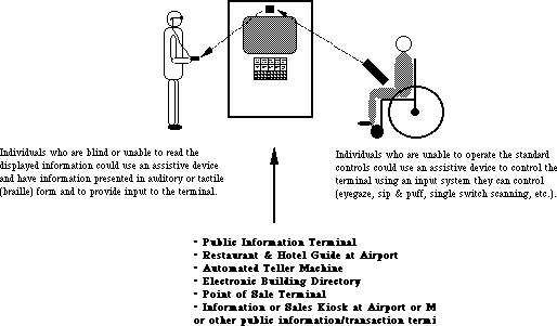 D
D
Individuals who are blind or unable to read the displayed information (as
the individual on the left) could use an assistive device to have
information presented in auditory or tactile (braille) form and
to provide input to the terminal.
Individuals who are unable to operate the standard controls (as
the individual on the right) could use an assistive device to
control the terminal using an input system they can control (eyegaze,
sip&puff, single switch scanning, etc.)
Figure I-7-c: An infra-red link could provide a more effective
way for people with movement limitations to operate automatic
"disability access" doors, and for people with vision
limitations to operate and monitor the progress of elevators and
other public access mechanisms.
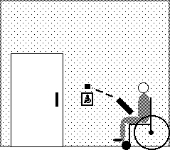 D
D
People who can drive their chairs but not operate the "disability
access" push plates could open the doors with signals from
their assistive devices. Similar ability to access and operate
security keypads and other control panels in a persons environment
would significantly decrease their dependence.
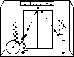
Individuals who cannot reach up and operate controls could operate them
through their
assistive devices.
The same infrared link could also provide information on the current
floor number to
people who are blind.
INPUT& CONTROL EXAMPLES: INTEGRATING THE GUIDELINES
Creating accessible input and control mechanisms that facilitate
use by all people, particularly those with multiple disabilities
requires careful balancing of the considerations. Below are some
examples that demonstrate controls that integrate cross disability
considerations in their design. Others will be added as the guidelines
evolve. In some cases the design has more features than are necessary
or has redundant features in order to demonstrate different possible
combinations.
EXAMPLE 1: Wisconsin #1 Knot
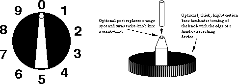 D
D
- Tactile pointer orientation (setting) can be easily determined
by grasping knob (Low Vision & Blindness).
- High contrast pointer against black backing disk. (Low Vision)
- Red-Orange spot reenforces pointer tip (spot can be illuminated
using plastic lightpipe) (Low Vision ).
- Knob turns easily but is damped to allow turning by pressure
on the side of either end of pointer or by rubbing on the edge
of the back disk. (Physical Impairment)
- Thick back disk is made of high traction plastic to allow
knob to be operated as an edge controlled knob. (Physical Impairment)
- Tactile detents on the major settings. If interscale settings
are important (as on an oven temperature dial) then additional
interscale detents would also be provided. (Low Vision, Blindness,
Physical Impairment)
- Plastic pointer spot on knob can be removed and replaced with
a small post to allow operation of the knob as a crank. (Physical
Impairment)
- Lettering on panel is large, sans-serif, bold and raised.
(Low Vision & Blindness)
- Space is available for optional braille back plate and very
large print backplate. (Low Vision & Blindness)
- Knob setting can be illustrated (in directions) or remembered
solely by visual orientation of knob, ignoring the actual printed
numbers. (Cognitive)
- Space and stationary dial plate allow special labels or pictures
to be attached for non-readers. (Cognitive)
- Numbers are stationary and all upright. (Low Vision, Blindness
& Cognitive)
- Uses clockwise movement convention for increasing values.
(Cognitive)
EXAMPLE 2
Poor Design
 D
D
- Controls not laid out to facilitate understanding if the legends
are not readable.
- On/off button is round and resembles the headphone jack.
- Unclear which button control which functions.
- Low contrast labels.
Better Design

- Volume controls are near the speaker which they affect. Channel
buttons are next to the channel display.
- Headphone jack is also adjacent the speaker.
- Up/down controls are positioned in a manner which suggests/reflects
their function.
- Channel display is large and uses broad stroke, brightly illuminated
characters.
- Photo sensor controls brightness of display to avoid glare
at night or fade-out in daytime.
- Legends are provided and are a higher contrast than above.
- Layout is such that the labels are redundant or fairly obvious
and the function of the controls is therefore easier to remember.
- Infra-Red remote control allows direct entry of channel on
numeric keypad for those whose sight is too poor to see large
display on television.
- Infra-Red remote ability also allows individuals to use special
remote controls including:
- ones with very large letters
- ones with pictures or symbols
- controls connected to special interfaces (e.g. communication
aids, environmental control aids, or computers) for users who
cannot control a standard keypad.
SECTION 3: MANIPULATIONS. Includes all actions that must be
directly performed by a person inconcert with the device or for
routine maintenance (e.g., inserting disk,loading tape, changing
ink cartridge)
Maximize the number of people who can ...
M-1. Maximize the number of individuals who can ... physically
insert and/or remove objects as required in the operation of a
device.
Problem:
Insertion and/or removal of objects required to operate some devices
(e.g., diskettes, compact discs, cassette tapes, credit cards,
keys, coins, currency) may be physically impossible. In addition,
damage to the object or device can occur from unsuccessful attempts.
Examples:
- Individuals using mouth sticks or other assistive devices may
have difficulty grasping an object and manipulating it as required
to insert or retrieve it from the device.
- Individuals with poor motor control may be unable to place a
semi-fragile object accurately into the device and retrieve without
damage (e.g., bending of floppy disk or credit card).
- Individuals with severe weakness may have difficulty reaching
the slot (or positioning the object) for insertion or removal.
- Individuals who are blind may be unable to determine proper
orientation or alignment for insertion (i.e., object may be held
upside down, backward or at the wrong angle).
Design Options and Ideas to Consider:
Facilitating orientation and insertion.
- Ensuring that objects can be inserted (and removed) with minimal
user reach and dexterity.
- Providing a simple funnelling system or other self-guidance/orienting
mechanism which will properly position the object for insertion.
- Allowing receptacles to be repositioned or re-angled to be
more reachable.
- Whenever possible, allowing the object to be inserted in several
ways (e.g., a six-side wrench can be positioned in a mating bolt
six different ways; two sided keys can be inserted upside down).
- Providing visual contrast between insertion point and the
rest of the device (making a more obvious "target").
- Clearly marking the proper orientation both visually and tactilely.
Facilitating removal.
- Providing ample ejection distance to facilitate easy gripping
and removal. (Ejection distance as large as possible while still
retaining a stable ejection.) See Figure M-1-b.
- Using push-button ejection, or automatic (motorized) ejection
mechanism.
Facilitating handling.
- Making objects to be inserted rugged and able to take rough
handling.
- Using objects with high friction surfaces for ease in grasping.
Additional Information:
- Orientation can be easily marked tactilely by having a clipped
corner or unsymmetrical shape.
- Consumers without disabilities also appreciate easier loading
systems.
- Use existing media with a hard or stiff outer shell and self-closing
cover for sensitive parts, so that they will be resistant to rough
treatment (e.g., 3-1/2" diskettes with hard plastic covers,
or tapes with self-closing protective doors).
 D
D
Figure M-1-a: Beveled slot facilitates insertion of cards,
disks, etc. Tactile and visual cues should also be provided to
indicate the proper orientation of the object to be inserted.
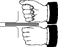 D
D
Figure M-1-b: Mechanisms which eject items at least 1"
and preferably 2" facilitate grasping of the item with tools,
reachers, teeth or fists for those who cannot effectively use
their hands/fingers.
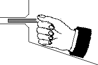 D
D
Figure M-1-c: Placing a stable surface under an insertion
slot allow individuals to steady their hand when inserting an
item. Be careful not to block access to the slot.
 D
D
Figure M-1-d: Phone jacks (such as found on headphones)
are superior to two prong plugs because they can be inserted in
any orientation and do not have to be twisted to align connectors.
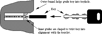 D
D
Figure M-1-e: Locks would be much easier to use if they
used two faced keys and had self orienting bevels that would turn
the key to the proper orientation to enter the slot. Alternately,
keys which do not have to be oriented could be used.
 D
D
(Reachers: La Buda 1975)
Figure M-1-f: Different aids used for reaching and grasping
include
reachers, mouthsticks with special ends, artificial hands and
hooks.
M-2. Maximize the number of people who can ... physically
handle and/or open the product.
Problem:
Handles, doorknobs, drawers, trays, etc. may be impossible for
some individuals to grasp or open.
Examples:
- People using mouth sticks or other assistive devices may be
unable to grasp handles, doorknobs, etc. in order to open or operate
the product, and may find it impossible to open doors or drawers
without handles (e.g, those using recessed "lips," or
those utilizing only side pressure to open).
- People with limited arm and hand movement (due to arthritis
or cerebral palsy, for example) may have problems grasping handles
that are in-line (straight).
- People with only one hand or with poor coordination may have
difficulty opening products which require two simultaneous actions
(e.g., stabilizing while opening or operating two latches which
spring closed).
Design Options and Ideas to Consider:
- Using doors with open handles, levers or doors which are pushed,
then spring open.
- Avoiding use of knobs or lips to open products.
- Avoiding dual latches that must be operated simultaneously.
- Using latches which are operable with a closed fist.
- Using bearings for drawers or heavy objects that must be moved.
- Providing electric pushbutton or remote control power openers.
- Shaping product and door handles, etc. to minimize the need
for bending the wrist or body. (See figure below for examples.)
- See I-5 for additional suggestions.
Additional Information:
- Offset handles are easier to grasp. A handle that is offset
with a longer horizontal shank at the bottom would be better than
one with a longer horizontal shank on top. This style is preferable
to knobs.
M-3. Maximize the number of people who can ... remove, replace,
or reposition often-used detachable parts.
Problem:
Covers, lids and other detachable parts may be difficult to remove,
replace, or reposition.
Examples:
- Individuals with poor motor control may be unable to replace
a cover or lid once it has been detached, because it was dropped
to the floor or into an inaccessible part of the product.
- Individuals with weakness may have difficulty repositioning
a keyboard, monitor or television if the resistance to movement
is high.
Design Options and Ideas to Consider:
- Devices with covers or lids could be hinged, have sliding
covers, or be electronically operated.
- Tethering covers and lids with a cord or wire.
- Making device components repositionable with a minimum of
force.
- Eliminate or limit tasks needed for consumer assembly, installation,
or maintenance of product.
Additional Information:
- Heavy or frequently positioned devices should be on a swivel
or other special base to facilitate repositioning.
M-4. Maximize the number of people who can ... understand
how to carry out the manipulations necessary to use the product.
Problem:
Some individuals may have difficulty remembering how to operate
the product, performing tasks in the correct order or within the
required time, making choices, doing required measurements, or
problem-solving.
Examples:
Some people (particularly those with learning disabilities or
cognitive impairments):
- have difficulty remembering codes required to operate a device
(e.g., PIN number for automated teller machine); they may also
be unable to remember which control to push to start or stop the
device.
- have difficulty with serial order recall (the ability to remember
items or tasks in sequence), and thus cannot follow complex or
numerous steps.
- have a slower or delayed reaction time, due to their inability
to remember things quickly or to make responses that are dependent
on timed input.
- get confused when there is a time lag for a response after
they issue a command or when they expect an immediate result.
- have trouble in choosing from available selection options
(e.g., selecting paper size on a printer, choosing settings on
a stereo).
- cannot understand the concept of measuring/quantifying.
- have significant difficulty finding out what and where the
problem is when a device is not functioning properly, and may
have difficulty identifying solutions to problems they have identified.
Design Options and Ideas to Consider:
Many of the problems in this category are similar to the problems
outlined in I-6 and many of the same
design ideas would
apply, including the following:
- Keeping things as simple as possible.
- Providing cues or prompts for sequences of actions required.
- Writing the instructions directly on the device.
- Having programmable keys for commonly used sequences.
- Providing an easy way out of any situation.
- Eliminating any timed responses (or make the times adjustable).
- Providing feedback to the user when the device is busy or
"thinking."
- Hiding seldom used controls which are not used primarily in
order to limit available choices.
Other design suggestions include:
- Incorporating pre-measuring methods whenever a quantifiable
amount is required.
- Providing prompts to inform users about the source(s) of problems
and lead them to action to be taken to solve the problems (e.g.,
lights and color-coded pictorials used in copying machines).
- Eliminating or simplifying consumer assembly, installation,
and maintenance of the product.
- Providing a "standard" key or default mode to operate
standardized functions (e.g., a key on the copier to give standard
size copies).
- Providing an automatic mode so that the machine will make
self-adjustments.
Additional Information:
- Examples of pre-measuring methods include pump-type dispensers,
individualized pre-measured packets and measuring devices incorporated
on the container (e.g., cap).
- Frequently used symbols and words for labelling controls can
be used to facilitate memory. Meanings for standardized symbols
and signs will be easier to remember.
- Break large tasks down into easily manageable steps by combining
commonly used sequences as a single choice (e.g., buttons on a
radio, macros, code numbers for recording specific programs on
the VCR).
- Sequences used to operate a device can be written on the device
so they do not have to be remembered.
- The device could bring up a hierarchical menu or prompts to
step the user through the operating sequence.
- Feedback could be provided to the user to identify the step
they are on or have just finished (e.g., beep when completed,
highlighting of next step in sequence menu).
- Information could be repeated/restated after a certain length
of time when no response is received, in order to cue the user
that a response is needed or to get the person's attention back
to the display.
- Warning cues can help increase the response time, when presented
immediately before the visual stimuli (e.g., auditory cue heard
before the elevator doors open).
- Several studies have shown that even the simple reaction time
at age 60 to respond to a visual or auditory stimuli is about
3 times slower than a 20-year-old.
- Devices that do not stop immediately after hitting a stop
button are confusing and can be dangerous without any visual indication.
SECTION 4: DOCUMENTATION. Primarily operating instructions
Maximize the number of people who can ...
D-1. Maximize the number of people who can
... access the documentation.
Problem:
Printed documentation (e.g. operating or installation instructions)
may not be readable.
Examples:
- Individuals with low vision may not be able to read documentation
due to small size or poor format.
- Poor choice of colors may make diagrams ambiguous for people
with color-blindness.
- People who are blind cannot use printed documentation, especially
graphics.
- People with severe physical impairments may find it difficult
or impossible to handle printed documentation.
Design Options and Ideas to Consider:
- Providing documentation in alternate formats: electronic,
large-print, audio tape, and/or braille.
- Using large fonts
- Using sans-serif fonts
- Making sure that...
- leading (space between the letters of a word)
- the space between lines
- the distance between topics is sufficient that the letters
and topics to stand out distinctly from each other.
- Making sure that leading (space between the letters of a word)
and the space between lines is sufficient that the letters stand
out distinctly from each other.
- Any information which is presented via color-coding could
be presented in some other way which doesn't rely on color (e.g.,
bar charts may use various black-and-white patterns under the
colors or patterns in the colors).
- Providing a text description of all graphics (this is especially
important for use in electronic, taped and large print forms).
- Providing basic instructions directly on the device as well
as in the documentation.
- Making printed documentation "Scanner/OCR-friendly"
(see below).
Additional Information:
- To test to see whether the pictures in a document are truly
covered in the text you remove the pictures, can you still figure
out how to use the device?
- Large print is very effective with older individuals who develop
low vision, since they often do not have powerful reading tools.
Large print labels (as recommended in I-3) might be provided
also.
- Block style and black-on-white background are easiest to see.
Stroke width-to-height ratios of 1:6 to 1:8 are best, where the
width is 2/3 the height. Capital letters and numbers are the most
easily read.
- As optical character recognition (OCR) software becomes
more sophisticated, it will become continually easier to be
"Scanner/OCR
friendly". Current scanners/OCR software have trouble with:
- text/background colors which are not high contrast (black
on white is recommended),
- highly stylized or broken fonts,
- pictures which are screened and placed behind the text,
- text which is not arranged in straight rectangular columns,
and
- text which flows around graphics.
- Electronic documentation has a number of advantages,
including:
- Eliminates the need to handle pages for people with physical
disabilities.
- Allows large on-screen presentation of information in optimal
fonts for people with low vision.
- Facilitates translation of the information into braille or
synthetic speech.
- Facilitates searching of text for particular words or topics.
- May be output in a variety of formats: speech, print, large
print, braille, etc.
- The most common format for electronic documentation today
would be in ASCII text on a 720K, 3-1/2" MS-DOS diskette,
although the information would optimally also be available in
MS-DOS 360K, 5-1/4" disks and Macintosh 800K disks. (See
O-5.)
- Page description languages may be standard enough
in the future that they would provide a better electronic documentation
format that could include additional types of information not
easily presented in ASCII-only files.
- Audio cassettes have the advantages that they are
relatively low cost and can be used by individuals with physical
disabilities, low vision, blindness, and learning disabilities.
Electronic documentation also has these characteristics (and is
even less expensive) but requires that the user have a computer
with suitable adaptive accessories.
- Video tapes are also effective, especially when the
video information is presented redundantly (i.e., the videotape
can be understood with the screen turned off).
- The product could contain a mail-in request for the
alternate forms of documentation.
D-2. Maximize the number of people who can
... understand the documentation.
Problem: Printed documentation (e.g. operating or
installation instructions) may not be understandable.
Examples:
- Individuals with cognitive impairments may have difficulty following
multi-step instructions.
- Individuals with language difficulties or for whom English is a
second language (including people with deafness) may have difficulty
understanding complex text.
- People with learning difficulties may have difficulty distinguishing
directional terms.
Design Options and Ideas to Consider:
- Providing clear, concise descriptions of the product and its
initial setup.
- Providing descriptions that do not require pictures (words and
numbers used redundantly with pictures
and tables), at least for all the basic operations (see below).
- Formatting with plenty of "white space" used to create
small text groupings, bullet points.
- Highlighting key information by using large, bold letters, and
put it near the front of text.
- Providing step-by-step instructions which are numbered, bulleted,
or have check boxes.
- Using affirmative instead of negative or passive statements.
Keeping sentence structure simple (i.e., one clause).
- Avoiding directional terms (e.g., left, right, up, down) where
possible.
- Providing a basic "bare bones" form or section to
the documentation that just gets you up and running with the basic
features.
NOTE: See also O-6, I-6 and M-4.
Additional Information:
- Tests to see whether the words and numbers in a document are
redundant with the pictures:
Test A: If you erase or obliterate the words and numbers, can
you still figure out how to use the device?
Test B: If you remove the pictures, can you still figure out
how to use the device?
- Audio and Video cassettes provide effective alternatives
to printed documentation and can show operation of products for people
who cannot read. For some products, carefully prepared
videotapes allow effective demonstration of product use even if
the person doesn't understand the language.
NOTE: See also additional information section in O-6, I-6
and M-4.
SECTION 5: SAFETY
Maximize the number of people who can ...
S-1. Maximize the number of people who can ... perceive hazard
warnings.
Problem:
Hazard warnings (alarms) are missed due to monosensory presentation
or lack of understandability.
Examples:
- Individuals with hearing impairments may not hear auditory
alarms which have only a narrow frequency spectrum.
- People who are deaf may not hear auditory alarms.
- People with visual impairments may not see visual warnings.
- People with cognitive impairments may not understand the nature
of a warning quickly enough.
Design Options and Ideas to Consider:
- Using a broad frequency spectrum with at least two frequency
components between 500 and 3000 Hz for alarm signals.
- Using redundant visual and auditory format for alarms (e.g.,
flashing lights plus alarm siren).
- Reducing glare on any surfaces containing warning messages.
- Using common color-coding conventions and/or symbols along
with simple warning messages.
- Providing an optional, carriable, vibrating module for use
by persons who are deaf.
Additional Information:
- For alerting devices the use of two or more spectral components
in the 500 - 4500 Hz range is recommended based on ringer studies
. Others suggest limiting the upper frequency to 3000 Hz
to better accommodate people with mid-high frequency loss.
- See I-6 for standard safety color
coding conventions.
S-2. Maximize the number of people who can ... use the product
without injury due to unperceived hazards or user's lack of motor
control.
Problem:
Users are injured because they are unaware of an "obvious"
hazard or because they lack sufficient motor control to avoid
hazards.
Examples:
- Individuals with visual impairments may not see a hazard which
is obvious to those with average sight.
- Individuals with lack of strength or muscle control may inadvertently
topple a device while in use so that it injures them.
- Individuals with incoordination or lack of muscle control
may inadvertently put their limbs or fingers in places not intended
for contact or other hazardous places (e.g., the casette tape
drive of a stereo contains sharp edges which can cut fingers jammed
inside with force).
- Individuals with cognitive impairments may be unable to remember
to shut off devices when not in use.
Design Options and Ideas to Consider:
- Eliminating or audibly warning of hazards which rely on the
user's visual ability to avoid.
- Making all surfaces, corners, protrusions and device entrances
free of sharp edges or extreme heat.
- Deburring any internal parts accessible by a body part, even
if contact with body part is not normally expected (e.g. inside
an open cassette tape door on a stereo).
- Providing automatic shut-off of devices which would present
a hazard if left on (e.g., irons).
- Ensuring that devices have stable, non-slip bases, or the
ability to be attached to a stable surface (see below).
Additional Information:
- In order to achieve maximum stabilization, devices should:
- have an area at or near a point of stability that is free
of sharp or delicate parts (to facilitate grasping);
- have a widening (or flaring) of the lower base to allow a
surface for the hand or limb to apply stabilizing pressure to
avoid tipping (if device has a circumference greater than an open
hand grip);
- ensure that extended switches or other attachments are firmly
supported, as many individuals with stability and coordination
problems may rely on them for support.
- Threaded, tapped holes (or lined holes suitable for self-tapping
screws) on the bottom of a product would allow the attachment
of a more stable base for those who require it.
Anderson, Thomas P., "Stroke and Cerebral Trauma: Medical
Aspects," in Handbook of Severe Disability, edited
by Walter C. Stolov and Michael R. Clowers. Washington, D.C.:
U.S. Department of Education, Rehabilitation Services Administration,
1981.
Berkowitz, J.P., and Casali, S.P., "Influence of Age on the
Ability to Hear Telephone Ringers of Different Spectral Content,"
Proceedings of the Human Factors Society 34th Annual Meeting,
1990, Vol. 1, pp. 132-136.
Corcoran, Paul J., "Neuromuscular Diseases," in Handbook
of Severe Disability, edited by Walter C. Stolov and Michael
R. Clowers. Washington, D.C.: U.S. Department of Education,
Rehabilitation
Services Administration, 1981.
Dreyfuse, H., Symbol Sourcebook: An Authoritative Guide to
International Graphic Symbols, 1972.
Elkind, Jerome, "The Incidence of Disabilities in the United
States," Human Factors, 1990, 32(4), pp. 397-405.
Friedmann, Lawrence W., "Amputation," in Handbook
of Severe Disability, edited by Walter C. Stolov and Michael
R. Clowers. Washington, D.C.: U.S. Department of Education,
Rehabilitation
Services Administration, 1981.
Grandjean, E., ed., Ergonomics of Computerized Offices.
Bristol, Pa.: Taylor & Francis, 1987.
Halpern, Andrew S., "Mental Retardation," in Handbook
of Severe Disability, edited by Walter C. Stolov and Michael
R. Clowers. Washington, D.C.: U.S. Department of Education,
Rehabilitation
Services Administration, 1981.
Hare, B.A., and Hare, J.M., Teaching Young Handicapped Children:
A Guide for Preschool and Elementary Grades. New York: Greene
& Stratton, 1977.
Hoover, Richard E., and Bledsoe, C. Warren, "Blindness and
Visual Impairments," in Handbook of Severe Disability,
edited by Walter C. Stolov and Michael R. Clowers. Washington,
D.C.: U.S. Department of Education, Rehabilitation Services
Administration,
1981.
Hunt, R.M., "Determination of an Effective Tone Ringer Signal,"
paper presented at the 38th Convention of the Audio Engineering
Society. New York: Audio Engineering Society, 1970.
LaPlante, Mitchell P., Data on Disability from the National
Health Interview Survey, 1983-85. Washington, D.C.: National
Institute on Disability and Rehabilitation Research, 1988.
Mueller, James, The Workplace Workbook: An Illustrated Guide
to Job Accommodation and Assistive Technology. Washington,
D.C.: RESNA Press, 1990.
National Institute of Handicapped Research, "Statistical
Findings of the Regional Spinal Cord Injury System," Rehab
Brief, Vol. VI, No. 3, March 1983.
Nicholas, John J., "Rheumatic Diseases," in Handbook
of Severe Disability, edited by Walter C. Stolov and Michael
R. Clowers. Washington, D.C.: U.S. Department of Education,
Rehabilitation
Services Administration, 1981.
Osborne, Ergonomics at Work, 1987.
Sanders, Mark S., and McCormick, Ernest J., Human Factors in
Engineering and Design. 6th ed. New York: McGraw-Hill, 1987.
Schein, Jerome D., "Hearing Impairments and Deafness,"
in Handbook of Severe Disability, edited by Walter C. Stolov
and Michael R. Clowers. Washington, D.C.: U.S. Department of Education,
Rehabilitation Services Administration, 1981.
United Cerebral Palsy Associations, Cerebral Palsy -- Facts
and Figures. New York: United Cerebral Palsy Associations,
1975.
Ward, Arthur A., Jr., Fraser, Robert T., and Troupin, Allan S.,
"Epilepsy," in Handbook of Severe Disability,
edited by Walter C. Stolov and Michael R. Clowers. Washington,
D.C.: U.S. Department of Education, Rehabilitation Services
Administration,
1981.
Ward, John T., "Designing Consumer Product Displays for the
Disabled," Proceedings of the Human Factors Society 34th
Annual Meeting, 1990, Vol. 1, pp. 448-451.
World Health Organization, International Classification of
Impairments, Disabilities, and Handicaps: A Manual of Classification
Relating to the Consequences of Disease. Geneva: WHO, 1980.
APPENDIX: GUIDELINES CHECKLISTS
Human Factors or Product Design departments in companies who manufacture
consumer products may wish to develop checklists from these Guidelines
for use by their design teams. As explained in Part III, the Guidelines
were written as generically as possible in order to cover a very
wide range of consumer products. Guidelines which are custom tailored
to specific product lines would in fact be more useful to designers
for that product line. It is possible to develop your own custom
Guidelines to fit particular types of products or product lines,
as discussed below.
Customization Process
As a first step you should determine which guidelines in the checklist
apply to your product(s). For example, a design team for stereo
systems may exclude from their checklist guideline O-2 (provide
redundant visual output for all auditory information) because
stereo systems are intended to provide sound which by its nature
cannot be conveyed visually in any satisfactory way (as a standard
part of the product). [A baby monitor however would not since
it is not primarily an audio device but rather a baby activity
monitor. A visual indication of sound from the baby is very useful.
See fig O-2-b.]
Next, the "Design Options and Ideas to Consider" sections
for each included guideline could serve as the basis for a checklist
approach to meeting each guideline. Only those options which may
apply to your product(s) would be included in the checklist. For
example, the stereo product line checklist may exclude the following
two design options included in the Guidelines for O-1:
Using sounds which have strong low frequency components.
(Excluded because stereos are designed to produce the
full spectrum of sounds called for in musical or spoken work recordings,
radio, etc.)
Presenting auditory information continuously or periodically
until the desired message is confirmed or acted upon. Spoken messages
could automatically repeat or have a mechanism for the user to
ask for them to be repeated.
(Excluded because the company does not intend to present anything
auditorially except for the musical or spoken word recordings,
radio, etc. which it is designed to reproduce. These recordings,
etc. do not require confirmation or action from the user.)
Specific information from the "Additional Information"
and "Illustrations" sections, as well as from your company's
experienced designers, may yield additional options or more
specifically-stated
options than those furnished in the general Guidelines. For example,
the stereo product line checklist may revise one option included
in the O-1 guideline as follows:
- Providing a volume adjustment, preferably using a visual volume
indicator (see examples below). Sound should be intelligible
(undistorted)
throughout the volume range.
Since your stereo equipment always has a volume control you
could edit the first part out and focus in on the second topic
in the sentence. It could also be "customized" to be
more specific (using information from the "Additional
Information"
and "Illustrations" sections). Your new version might
look like:
- Using visual volume indicators, such as a painted dot or arrow
on the control dial, a sliding bar volume control, numbers or
graphics on a thumbwheel dial (see illustrations below).
Example Checklists
In order to demonstrate several formats and customization approaches,
this Appendix will contain several examples of checklists developed
for specific product lines.
[EXAMPLES NOT YET COMPLETED]
 D
D D
D D
D D
D D
D D
D D
D D
D D
D D
D D
D D
D D
D D
D D
Keypad on which edge views below are based.


 D
D D
D D
D D
D D
D D
D D
D D
D
 D
D
 D
D D
D D
D D
D D
D D
D